Boss, Where's the Chemical Barn?
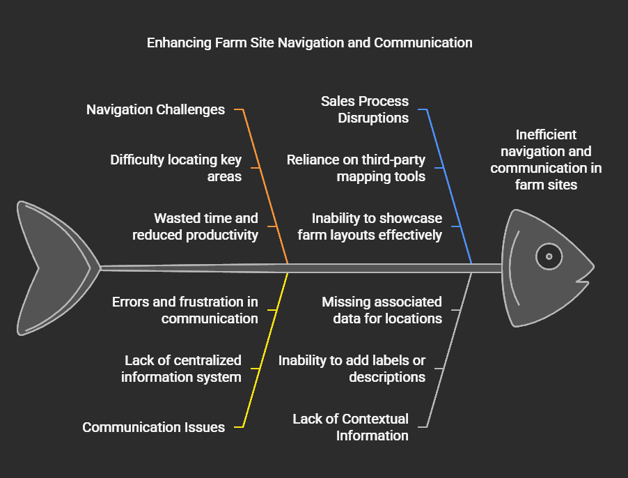
A farm can be thousands of acres. A temporary worker on their first week doesn’t know where the chemical barn is, which field is which, or where to find the pump. The INCYT map showed them everything, except where anything actually was.
That was the starting point. It got more interesting from there.
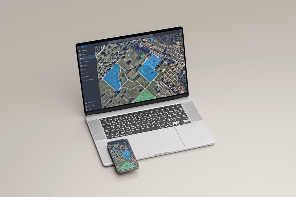
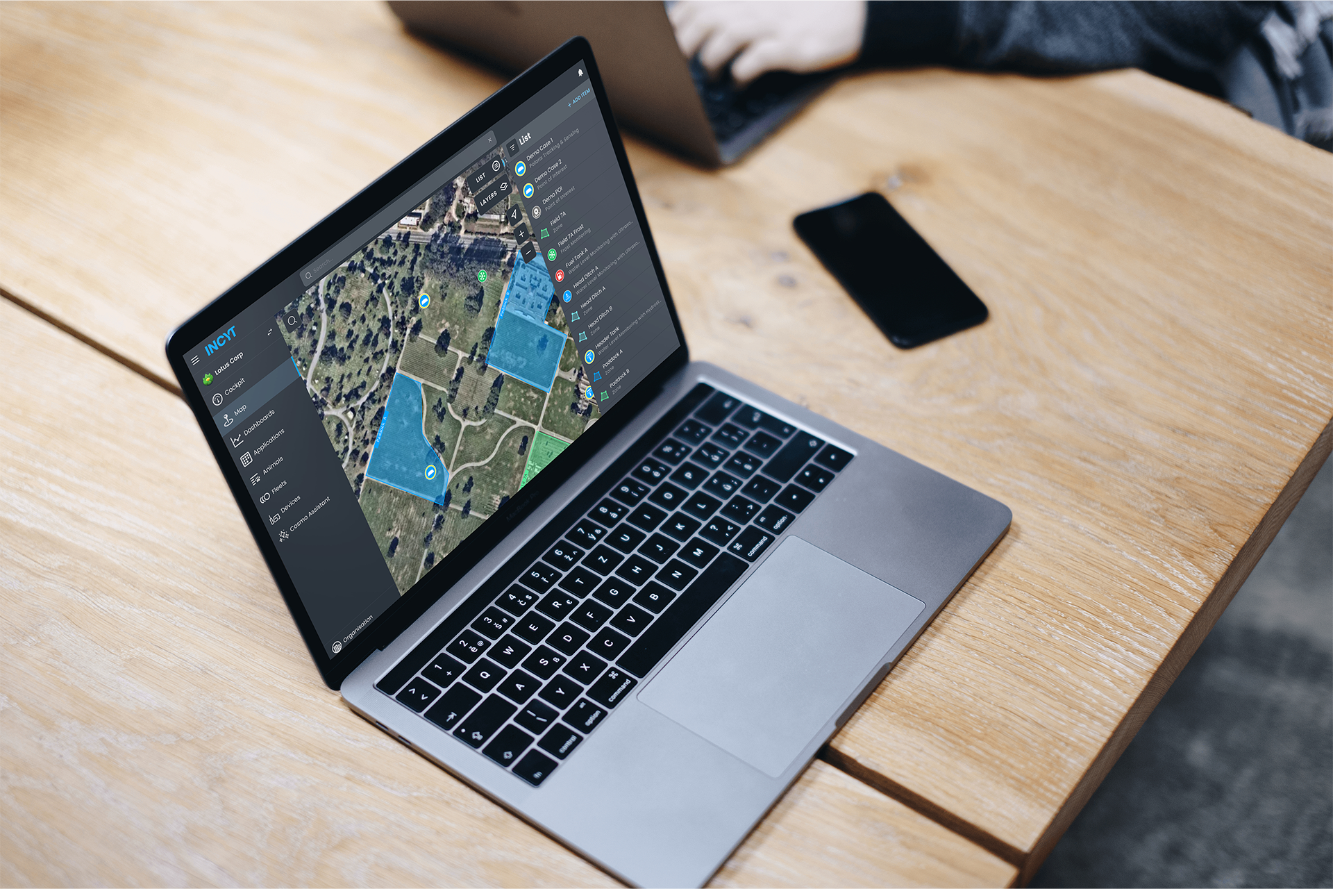
The map showed the farm.
It couldn’t tell you where to go.
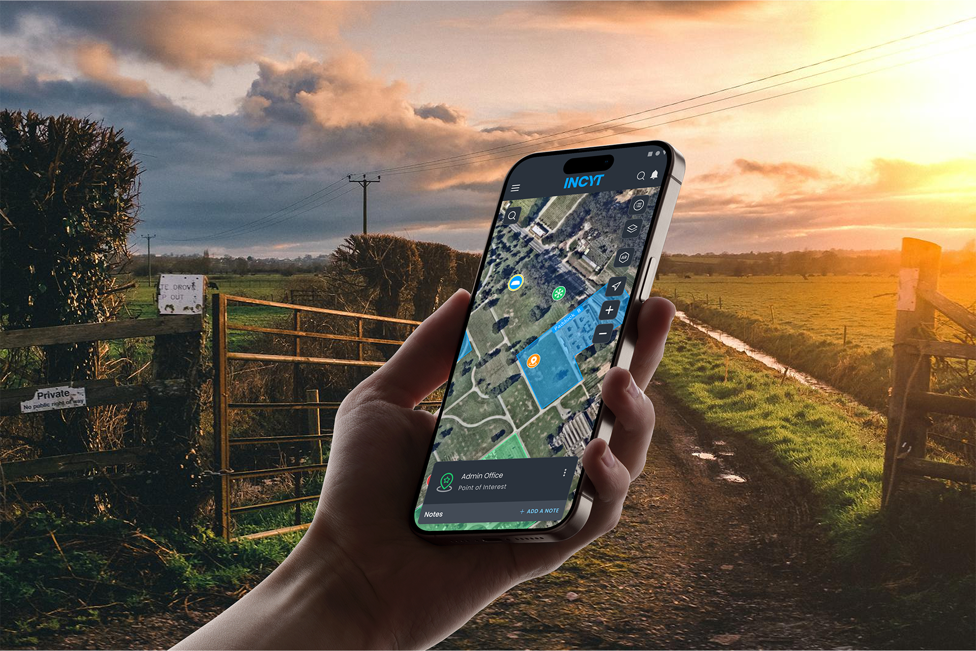
Part-time and temporary workers were spending upward of an hour navigating to locations their managers assumed were obvious. The INCYT map had layers of data — sensor readings, zone boundaries, application history — but no way to say “the chemical barn is here” or “that’s the field we need today.” Workers were navigating by verbal instruction, hand-drawn maps, and memory. The result was lost time, disrupted workflows, and managers who couldn’t stop being traffic coordinators long enough to manage anything else.
Thirty-six percent of existing users had already asked for this feature directly. That’s not a feature request, that’s users telling you something that should already exist.
Sales was selling INCYT with a different app open.
The navigation problem was visible. The sales problem was quieter but equally real. When reps visited prospective clients on-site, they were using third-party mapping tools to show farm layouts. And then trying to connect what they’d shown in one app to what INCYT could do in another. The pitch was fragmented, and the full value of the platform was getting lost in the gap between the two.
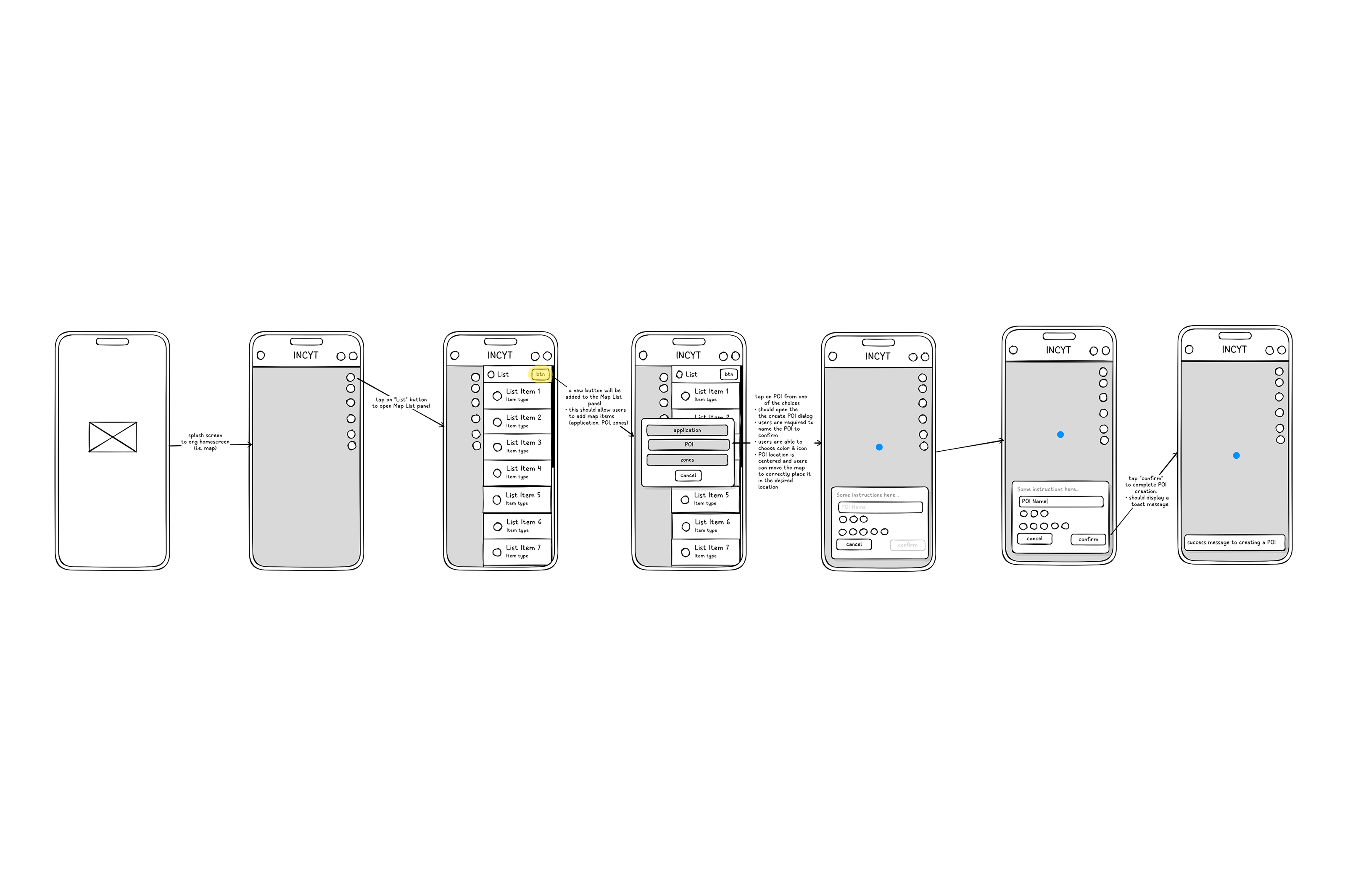
A POI feature built into INCYT meant sales could walk a client through their own farm, inside the platform, during the visit. That’s a different kind of demo.
The obvious solution wasn’t the right one.
The first instinct was a dedicated POI tab. A new section, a clear home. We prototyped it, tested it, and watched users hesitate. Another tab meant more decisions, more navigation, more things to learn. The interface was already information-dense and could result to higher cognitive loads — a new section made things feel heavier, not simpler.
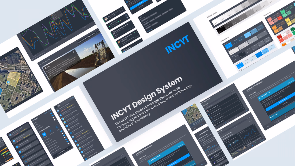
The solution that held up: integrating POIs under the existing “Add An Item” button in the List panel, alongside Zones and Applications. One entry point, consistent with how users already added things to the map. Keyboard shortcuts for power users: P for POI, Z for Zones, A for Applications. Rich-text notes per pin. Colors and icons borrowed from the existing Application style so nothing felt foreign.
The logic: if you’re already in the List panel managing zones, you’re one click from a POI. No new mental model required.
What shipped, and what I can actually own.
The feature launched in November 2024. Within three months, 44% of users reported improved daily operations directly tied to POI. Leads from sales site visits increased by 16% — the sales angle wasn’t hypothetical, it worked. Map session frequency and average duration both went up.
What didn’t go perfectly: keyboard shortcuts had reliability issues for larger organizations with high volumes of existing Applications. And moving Zones to the List panel drew pushback from 27% of existing users who were used to finding them in the Layers panel. Both got flagged for the next iteration before I wrapped up.
What I’d do differently.
The Zone placement decision is the one that stings. It made logical sense — grouping everything under “Add An Item” was cleaner. But we didn’t adequately test that specific change with users who already had an established Zones workflow. We tested the POI feature. We didn’t test the disruption to existing behavior.
The rule I’d carry forward: new features need to be tested in the context of existing habits, not in isolation. A feature can be intuitive for new users and disorienting for current ones at the same time. Both are valid data points. Both need weight in the decision.