From Forms to Futures
Newl had a working product. The AI was generating plausible futures based on your answers to a series of questions. Career paths and life scenarios, weighted against your values and constraints. The logic was solid. The problem was it felt like filling out tax forms.
That’s not a small problem when your product is supposed to help someone imagine their own future in hopes of helping them come up with a decision.
The product worked. The experience didn’t signal what it was.
When I came on as a consultant, the founder had already done the hard part: she’d built the thing. The flows existed. The AI outputs were meaningful. But the UI communicated none of that. It was functional and plain in a way that felt accidental rather than intentional — basic form inputs, no visual hierarchy, nothing that told users they were about to do something worth their time.
The brief wasn’t to redesign from scratch. It was the opposite: leave what works alone, clean up what’s muddying it, and find the places where a design decision could change how the product feels without requiring a full rebuild.
That constraint ended up being useful.
Fixing semantics before adding pixels.
The first thing I did was map what was already there. Not to audit it forensically, but to understand the bones — what each screen was actually doing, what users were being asked to decide, and where the experience was asking too much or explaining too little.
Two things became clear quickly.
One: the product had a natural arc — setup, exploration, reflection, action — but the UI treated each step as an isolated form. There was no sense of progression, no feeling of moving through something. Users had no way to understand where they were or that there was somewhere meaningful to end up.
Two: the AI output was genuinely interesting, but it was buried. Comparison scores, pattern insights, tension callouts — all of it rendered in the visual language of a data table rather than a moment of clarity.
These weren’t UI problems. They were information architecture and hierarchy problems that had UI consequences.
Design and prototype in the same loop.
The process wasn’t linear. High-fidelity screens went into Figma Make for interactive prototyping almost immediately, not to validate concepts, but because interactions and animations were part of the design. Knowing how a card would enter the viewport, how the accordion would expand, how the loader would transition into the Summary — those weren’t details to figure out later. They were load-bearing decisions that affected whether a screen felt immersive or flat.
That loop — design, prototype, review with the founder, refine — compressed what might have taken weeks of back-and-forth into something faster and more concrete. It also meant the founder could react to something real rather than something described.
Two modes. One product.
The clearest structural decision we made was to split the experience into two distinct modes: session and application.
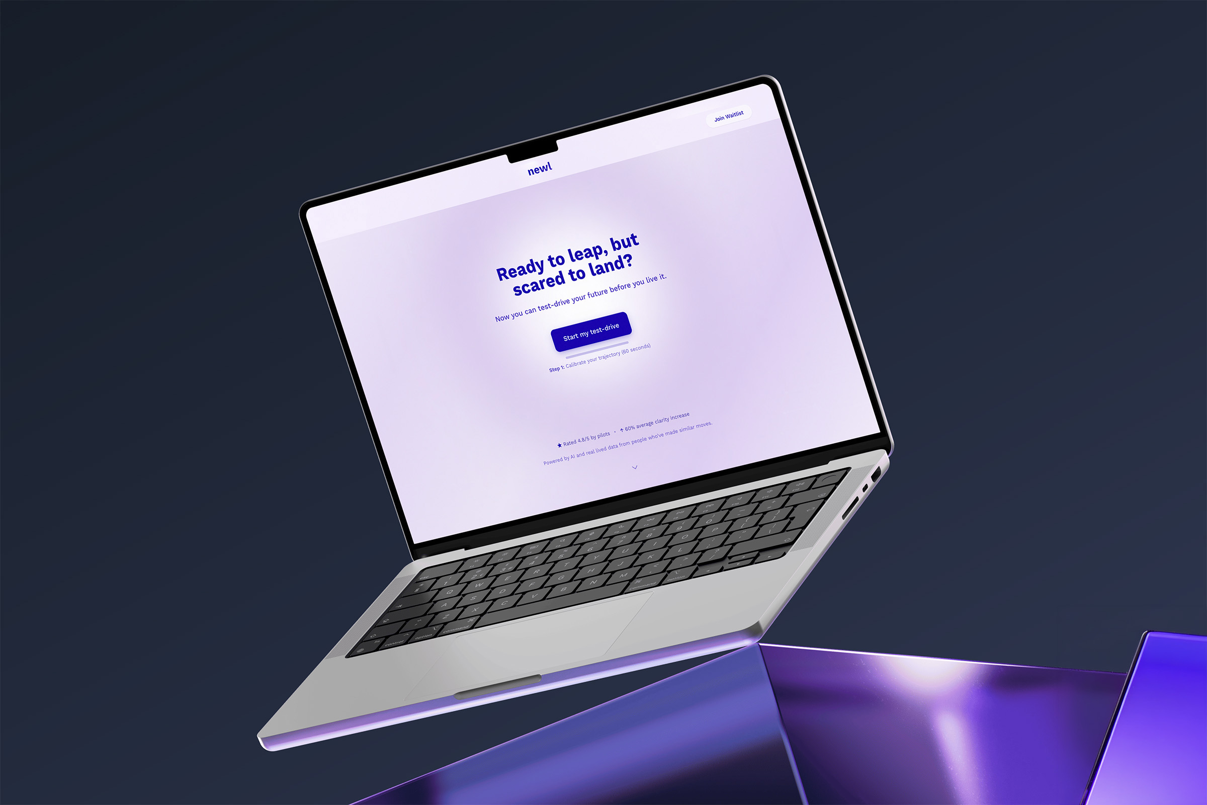
Session mode is immersive. You’re inside a future. The visual treatment — a full-width purple-to-blue gradient, glass-style cards, progressive reveals — was designed to signal that this is different from a dashboard or a form. You’re not inputting data. You’re doing something closer to imagining. The tone of the copy shifted to match: less instructional, more reflective.
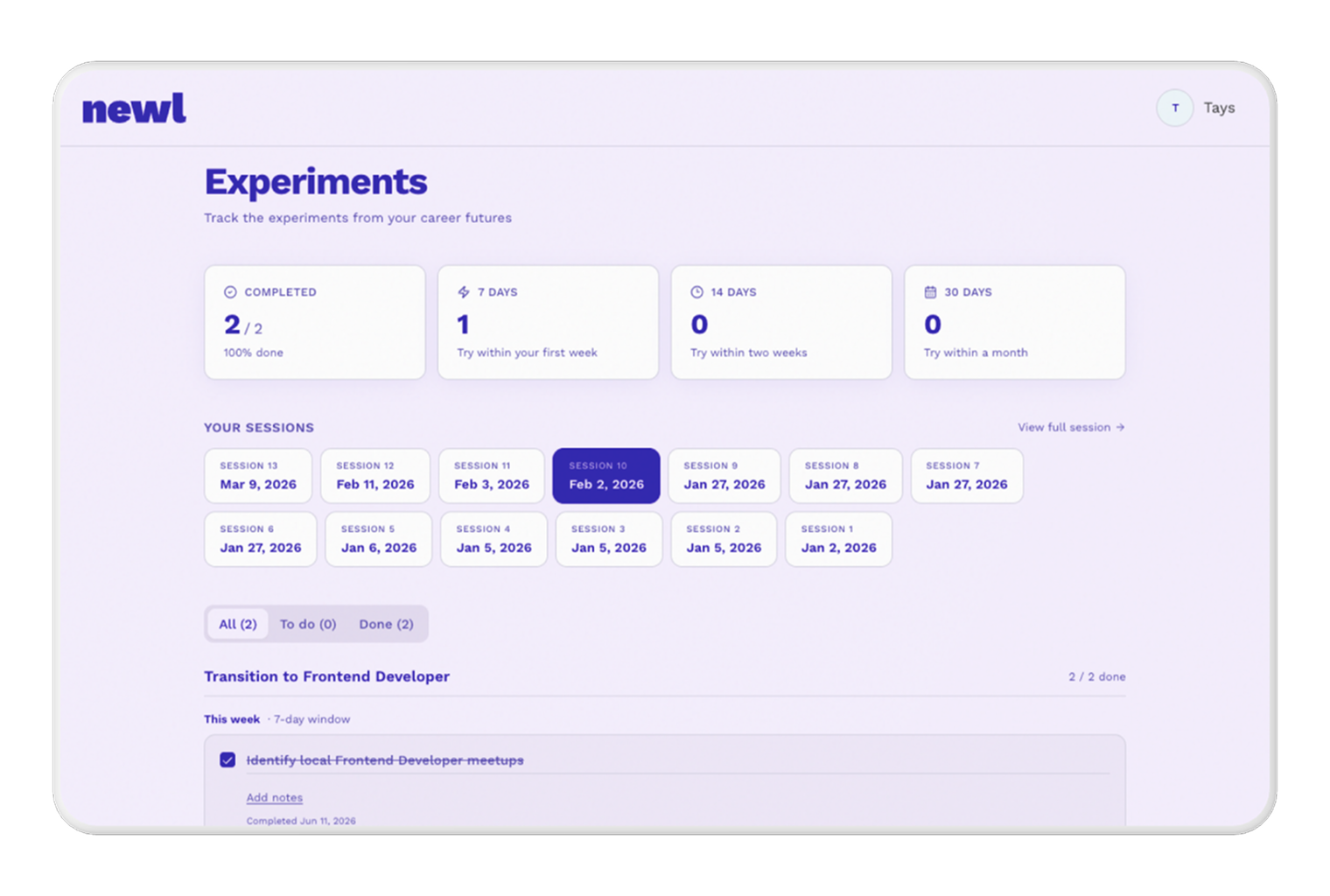
Application mode is the inverse — light background, utility layout, lower emotional register. The dashboard lives here. It’s where you manage sessions, track experiments, and resume work. It’s a control center, not an experience.
Naming that distinction explicitly gave every subsequent decision a clear test: does this belong to session or application? That question resolved more debates than any visual preference.
Navigation as a product commitment.
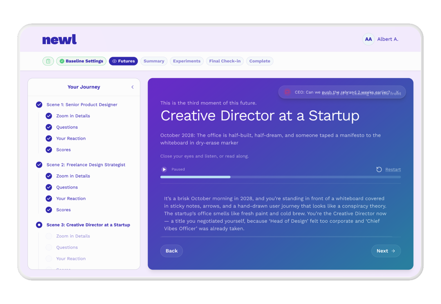
One of the bigger UX changes was making the top navigation persistent and meaningful across the entire session — Baseline Settings, Futures, Summary, Experiments, Final Check-in, Complete — visible throughout, not just at the start or end.
The rule we established: once a section is unlocked, it stays accessible. Return to Futures after completing your Summary and you see your completed futures — not an empty state, not the initial input form. Your work is preserved. The navigation communicates that the product trusts you to move non-linearly, which is a more honest representation of how people actually think through decisions.
That became a global product principle that touched every screen.
Copy as a design decision.
One thing this project made explicit: copy isn’t a last step. On a product like Newl, where the entire value proposition depends on users feeling something, not just doing something, the words on screen are doing as much work as the layout.
“Where your energy seems to point” instead of “Your strongest future.” “Start here — these experiments relate to your strongest future” instead of a generic label. “Your future isn’t fixed — but now you have signals to follow” as the closing line on the Complete screen. These weren’t polish decisions. They were framing decisions that determined whether the product felt like a tool or an experience.
Rewriting copy across screens to maintain a consistent voice — reflective, confident, never prescriptive — was as much a part of the design work as any component.
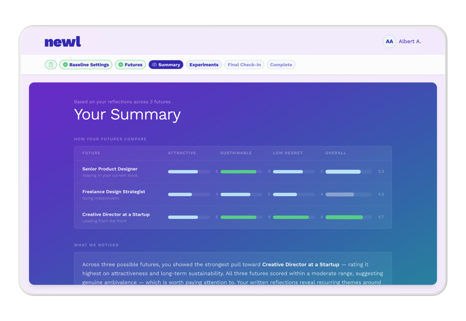
The Summary screen was the product’s strongest moment.
This was the screen with the most to gain from design intervention. The AI had already done the analytical work — identifying tensions, surfacing patterns, calling out where your energy seemed to be pointing. The design just needed to let that land.
The top future got a Top Pick badge and slightly elevated visual treatment — a glow, not a giant card — because there’s a difference between signaling confidence and feeling manipulative. Staggered animations meant the top pick appeared first, drawing attention before secondary options entered. Scroll-based reveals kept content below the fold from competing with what was immediately relevant.
The copy shift mattered as much as the layout. “Where your energy seems to point” instead of “Your strongest future.” A small edit. Meaningfully different framing.
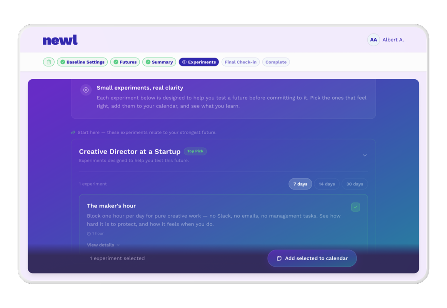
Experiments: structure that reduces overwhelm by default.
The Experiments screen was being asked to do too much at once. Every future with equal weight, every experiment at the same visual level. Users were looking at a wall of options with no clear starting point.
The fix was structural: experiments live inside their scene card as an accordion, not floating independently below it. The Top Pick future opens expanded by default. Everything else starts collapsed. Time horizon defaults to 7 days — lower commitment, more actionable, better chance someone actually does it.
This is the kind of decision that’s easy to miss in a prototype review and impossible to ignore once you’ve tested it. Default states aren’t neutral. They’re recommendations. We made them explicit.
The preview gate: designing around a business constraint.
One screen that doesn’t get talked about in most case studies is the paywall. Newl had a preview gate — a point in the flow where users needed to unlock their futures before continuing. The risk was obvious: a hard stop in the middle of an immersive experience breaks the spell.
The approach was to keep users inside the experience rather than redirecting them out of it. The unlock interaction opens as a side sheet, so the blurred future scene remains visible behind it. The value being unlocked stays in view while the transaction happens. After completion, the page refreshes with everything already unlocked — no jarring navigation change, no loss of context.
Designing a paywall that feels like part of the product rather than a interruption to it is a constraint worth documenting.
What shipped, and what I can own.
This was a three-month engagement. The deliverable was a set of approved designs in Figma — screens, flows, interaction decisions, and the reasoning behind them — handed directly to the founder for implementation.
No metrics yet. The product was still in development when my involvement wrapped, and I was working closely with the founder without visibility into the broader team or timeline. What I can say is: every screen went through review, the decisions were grounded in the product’s actual logic rather than aesthetic preference, and the founder had clear, implementable specs to work from.
What I’d do differently.
Working directly with a solo founder is efficient in some ways and limiting in others. Decisions moved fast. But I had no visibility into what real users were feeling when they hit the original product — no session recordings, no dropout data, no interview notes. I was working from informed instinct and the founder’s feedback.
I’d push earlier for even lightweight user contact. Not a formal research phase — just a handful of people going through the original flow while thinking out loud. The structural problems were visible without that. The priority order might have looked different with it.