Designing Clarity for the Coop
FLOX had a working product. It just didn’t look like one — not in the way that inspires confidence in a farm manager sitting across from a sales rep. The UI was dark by default because engineers prefer dark mode. Colors were chosen because they rendered correctly, not because they communicated anything. Components existed, but nobody had documented what they were for or where they lived. The product worked. The design was nobody’s job.
That was the starting point.
The legacy wasn’t a starting point. It was a warning.
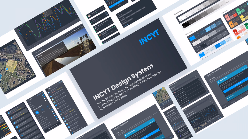
Walking into an engineering-led product as the first designer means spending time on things that don’t feel like design work. Before touching a single token or opening Figma, I had to understand what actually existed. That meant cataloguing every component, every screen state, every place a particular element appeared — and documenting why it was there.
This wasn’t glamorous. But you can’t make decisions about what to standardize if you don’t know what you’re standardizing. And in a domain-specific product like FLOX, where the same interface is used by farm managers, integrators, and industry experts, understanding context of use isn’t optional. The audit was the foundation. Everything after it had a reason.
Colour isn’t decoration when the stakes are real.
In a generic SaaS product, colour decisions are mostly brand decisions. In a poultry analytics platform, they’re operational ones. Orange means something. Red means something different. Green means the flock is fine. If a farm manager misreads a welfare alert because the visual language is ambiguous, that’s not a UX problem — it’s a welfare problem.
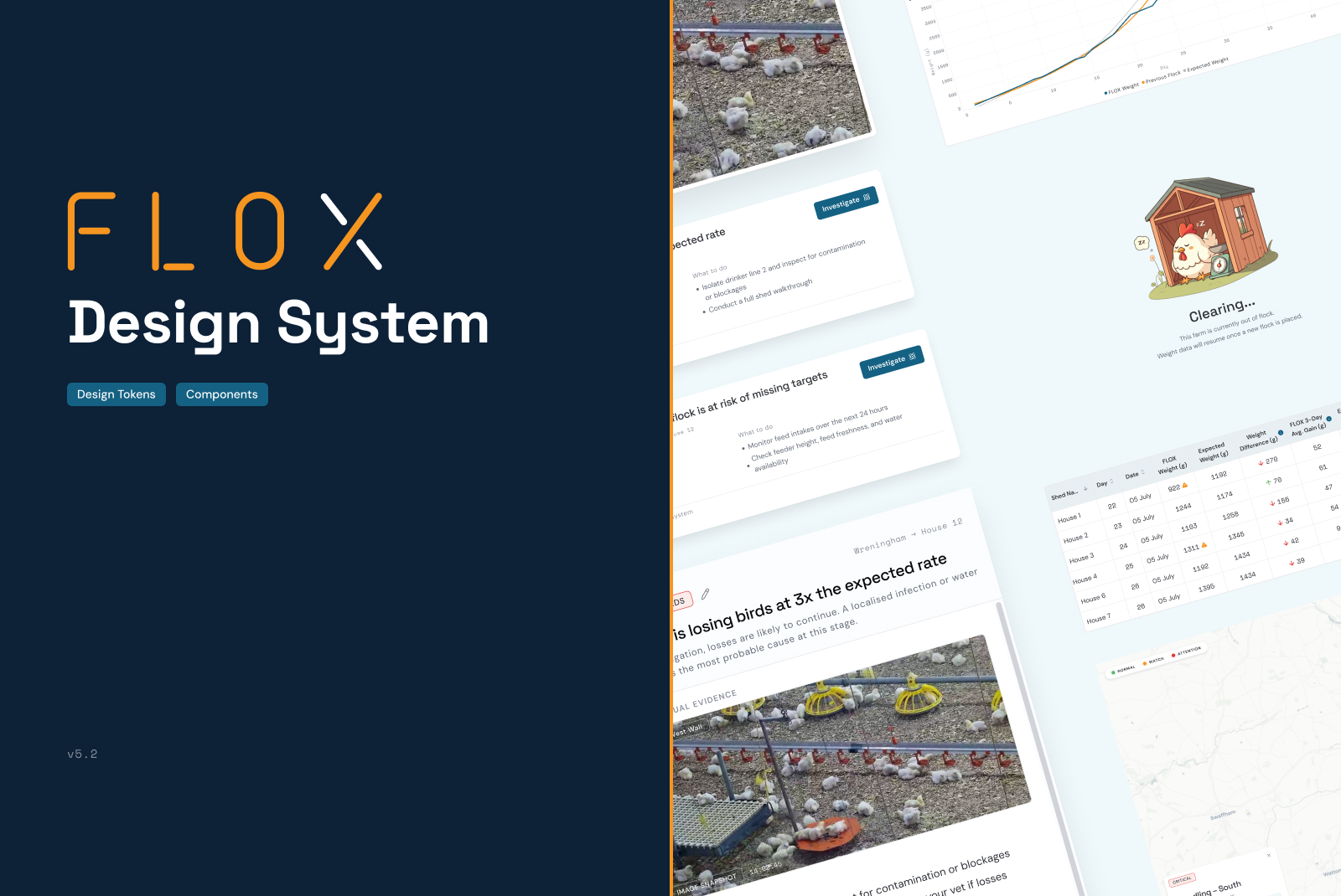
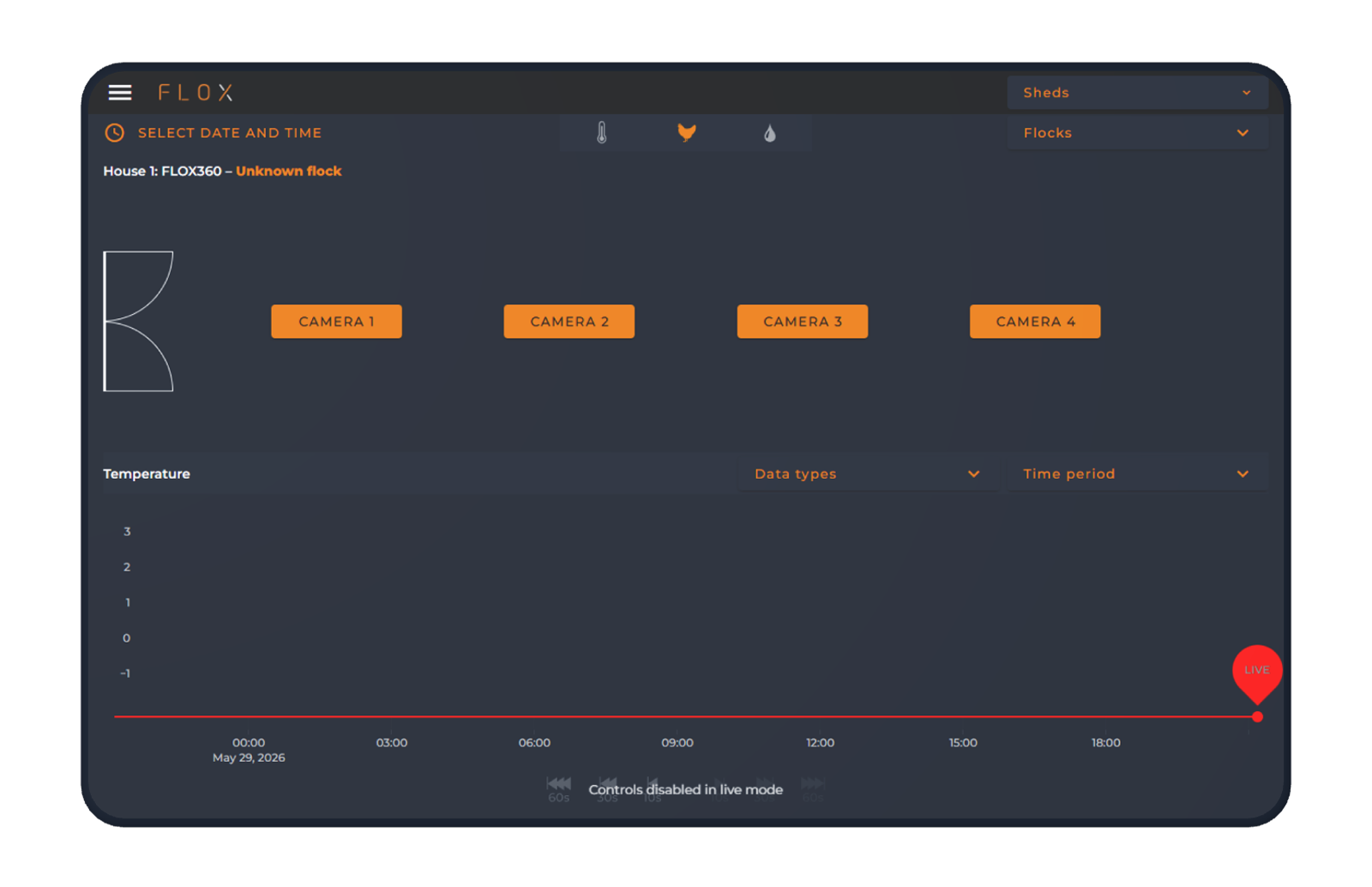
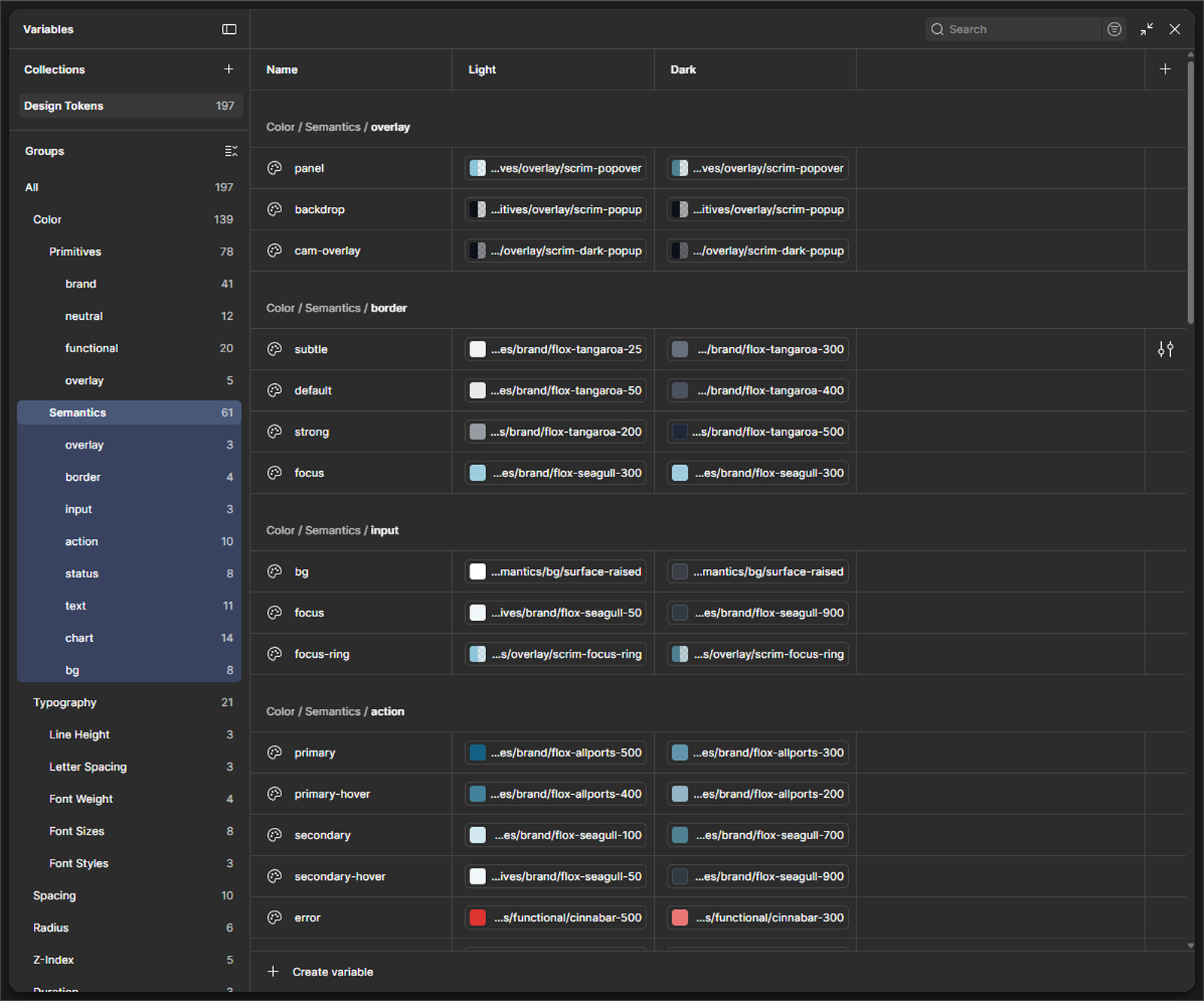
The legacy UI had no intentional colour logic. What I built was a semantic token system where every colour has a defined role and nothing is decorative by accident. Tangaroa as the primary surface — dark, grounded, appropriate for a product used in low-light environments and long sessions. Carrot for attention and interactive elements, not warnings. Cinnabar for errors and critical alerts. Green reserved strictly for healthy status. Seagull and Allports for data layers and secondary information.
The logic isn’t arbitrary. It maps to how farm operators already read their environment: green is good, orange means pay attention, red means act now. The system just had to stop fighting that instinct and start working with it.
Figma first. Storybook when I was ready.
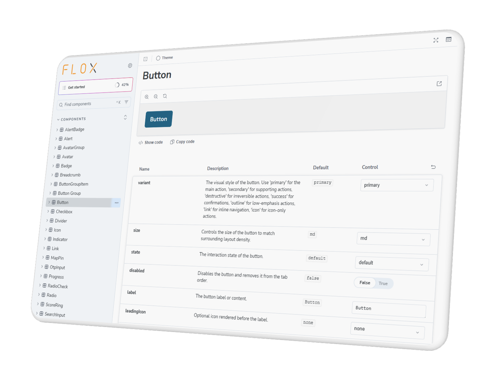
The system started in Figma. Tokens defined, components built with variants, documentation written in language that engineers could act on without a walkthrough. That part was familiar. What I wanted to own next was the implementation side — not because engineering couldn’t handle it, but because a design system maintained by someone else is a design system you’ve already started to lose.
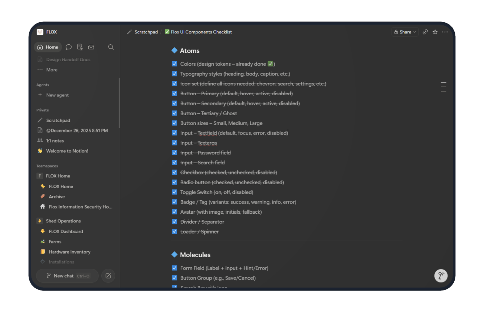
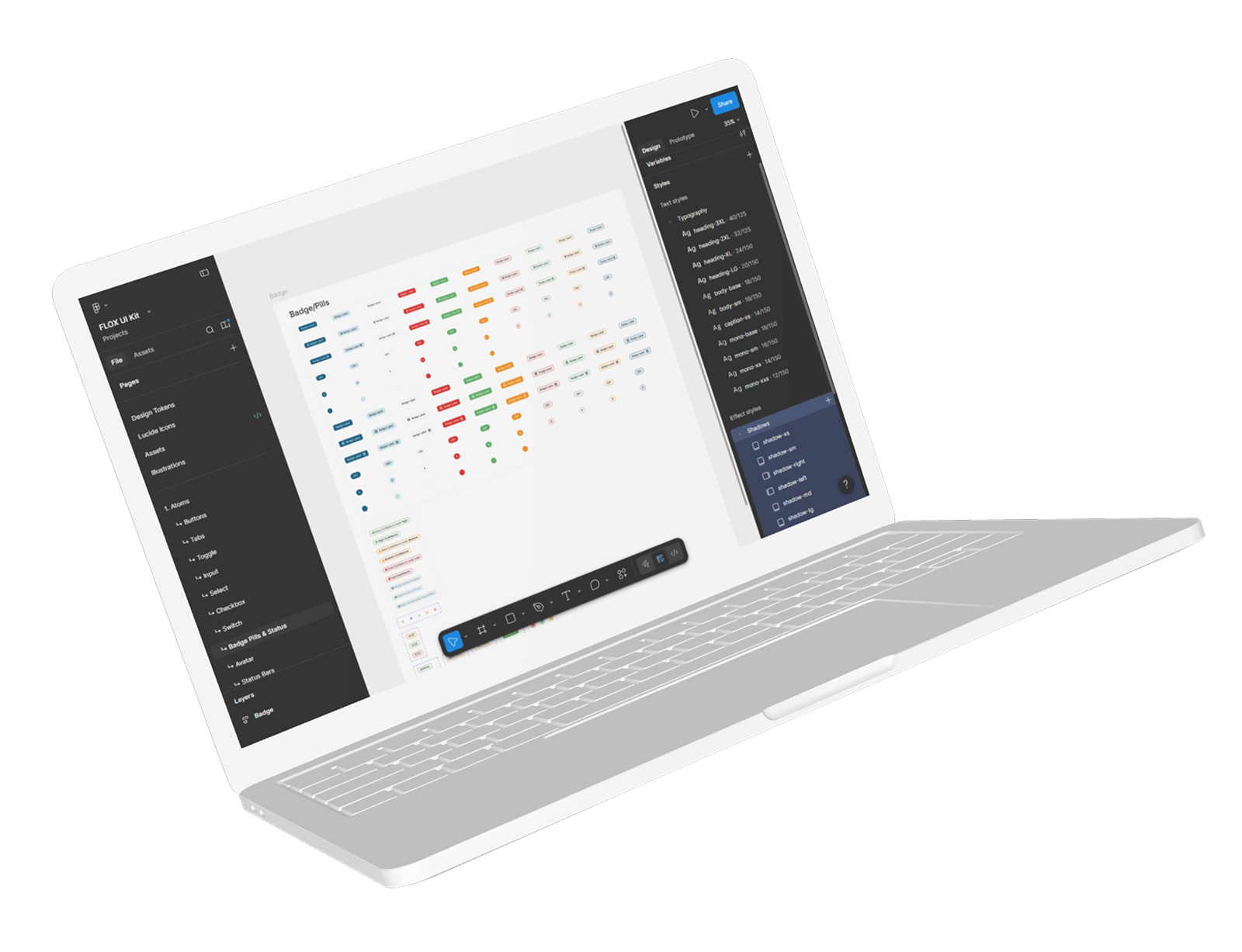
Storybook came once I was confident enough to push there myself. The workflow that made it possible: Cursor with the Figma MCP connector. The agent had direct read access to my Figma file — component specs, token values, layout rules — which meant I wasn’t translating my own designs into prompts. I was prompting from the actual source of truth. Components went in one by one. Atoms first — buttons, badges, inputs, status indicators. Then molecules. Then layout components that pulled everything together.
I reviewed every output against the Figma spec. Pushed changes to the shared repo the team had set up. Iterated from there. It wasn’t fast. But it was mine — and more importantly, it was accurate.
Built for engineers. Inherited by designers.
For most of the system’s life, the only consumers were engineers. That shaped how I wrote documentation — specs in code-adjacent language, token names that matched what engineers would expect, usage notes that addressed implementation questions rather than design intent. A system nobody uses is just a Figma file.
Designers came in later. And the first thing they flagged was accessibility. Which was fair. Working alone, with engineering resources stretched and features shipping continuously, accessibility had been sidelined in a way I’m not proud of. Colour contrast ratios weren’t where they needed to be across all states. Focus indicators were inconsistent. The incoming designers were right to call it out, and the fact that the system was documented well enough for them to audit it quickly was at least something.
The system held. The gaps were real. Both things are true.
What shipped, and what I can actually own.
FLOX went from an undocumented engineering UI to a structured system with defined tokens, a component library in Figma, and a Storybook implementation that the engineering team works from. New features are assembled from existing components rather than re-invented each time. The visual language is intentional now — every colour has a role, every component has a documented context of use.
The qualitative feedback from the stakeholder and user sessions was strong enough that the team greenlit the next major product layer: the full Farm Intelligence suite. That’s what gets built on top of this system. That’s the clearest signal I have that it worked.
What I can’t own: the accessibility gaps. They’re being addressed, but they should have been built in from the start. Being a lone designer is a constraint, not an excuse.
What I’d do differently.
Accessibility from day one — not as a retrofit, not as a later-phase concern, not something to revisit when there’s more time. There’s never more time. The cost of baking it in at the token and component level is low. The cost of auditing and fixing it across an entire system after the fact is high, and it falls on whoever comes next.
I’d also push for at least a part-time engineering partner in the Storybook phase earlier. Owning the implementation was the right instinct for maintaining system integrity — but doing it entirely solo slowed the rollout more than it needed to. The goal was ownership, not isolation. Those aren’t the same thing.