Don't Make Me Read the Chart
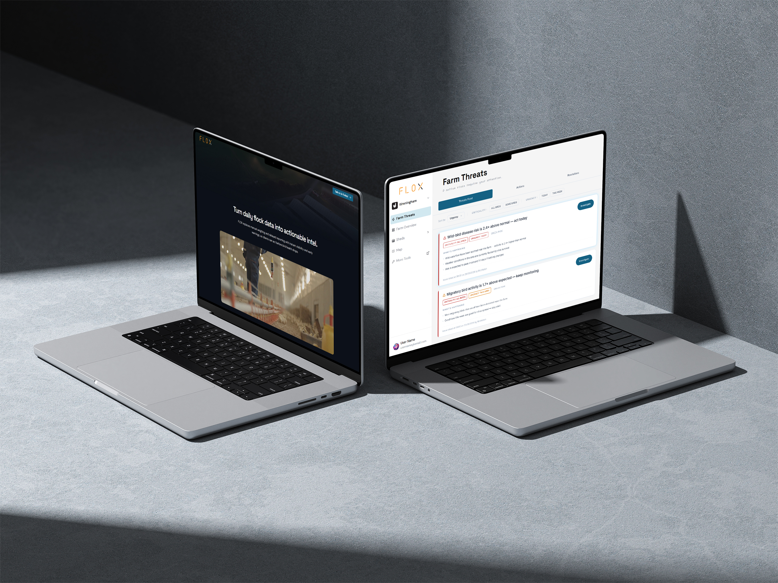
The Farm Intelligence dashboard was the plan. One unified view of everything — weight data, sensor readings, camera feeds — structured clearly enough that any farm manager could open it and understand what was happening on their operation. User interviews confirmed it was working. Farmers said it was clean, easy to follow, and made sense.
Then they said they didn’t actually have time to sit with it.
That’s a different kind of problem. Not a comprehension problem. A workflow one. And it pushed the product in a direction we hadn’t originally planned for.
The dashboard worked.
That wasn’t enough.
The original model was observation-first — give farmers structured access to their data and trust that understanding would lead to action. It was a reasonable assumption. It was wrong.
Farmers and farm managers aren’t data analysts. They’re on-site, moving between sheds, dealing with a hundred variables at once. Sitting down with a dashboard to read weight curves and sensor trends isn’t part of the workflow — it’s an interruption to it. The feedback from user interviews wasn’t that the data was hard to understand. It was that being expected to interpret it at all was the problem.
What they wanted was simple: tell me what’s wrong. Point me there. Let me fix it.
That shifted the product from observation-first to a hybrid model — one that still offered the full data layer for those who wanted it, but led with decisions for everyone else. Threat Intelligence was the feature that made that shift real.
An alert nobody trusts is worse than no alert at all.
The first design question wasn’t what alerts should look like. It was what they should be.
An alert system that fires too often becomes noise. Noise becomes habit to ignore. A farmer who’s learned to dismiss alerts because they’re usually wrong will dismiss the one that matters. So before any UI work began, we worked with the data team to define which anomalies were actually worth surfacing — and which ones the system could technically detect but shouldn’t, yet.
The MVP scope landed on five alert types with clearly defined data sources and confirmed technical readiness. Hock burn and PMI risk — both data-driven, both immediately feasible. Out-of-range environment alerts covering temperature and humidity thresholds. Mortality risk alerts, triggered when converging factors reach a point where elevated losses become likely. And predictive weight deviation — flagging when a flock is tracking behind target weight early enough for intervention to matter.
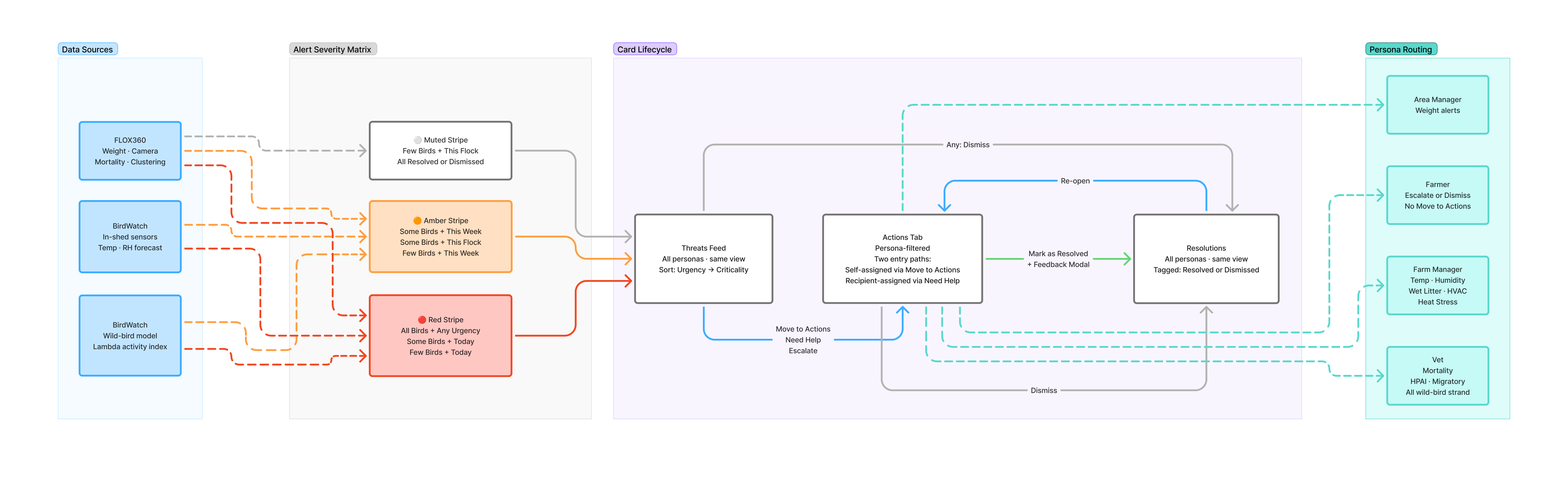
Each alert type has a designated owner — because the person best placed to act on a temperature spike is not the same as the person who should be called for a mortality risk. Farm Manager owns temperature, humidity, and environmental alerts. Area Manager owns weight. Vet owns mortality. The escalation target is determined automatically by alert type, not by the farmer making a judgment call in the field. A second alert category — nine new types sourced from a BirdWatch integration with ESA wild-bird monitoring data — extends this routing further: wild-bird and disease-vector alerts route to the Vet, in-shed environmental forecast alerts route to the Farm Manager. Same ownership logic, new signal sources.
Longer-term alert types — intruder detection, water leak via camera analysis, clustering events — are confirmed as feasible but deprioritised for later sprints. They’re in the anomaly table. They’re not in the MVP.
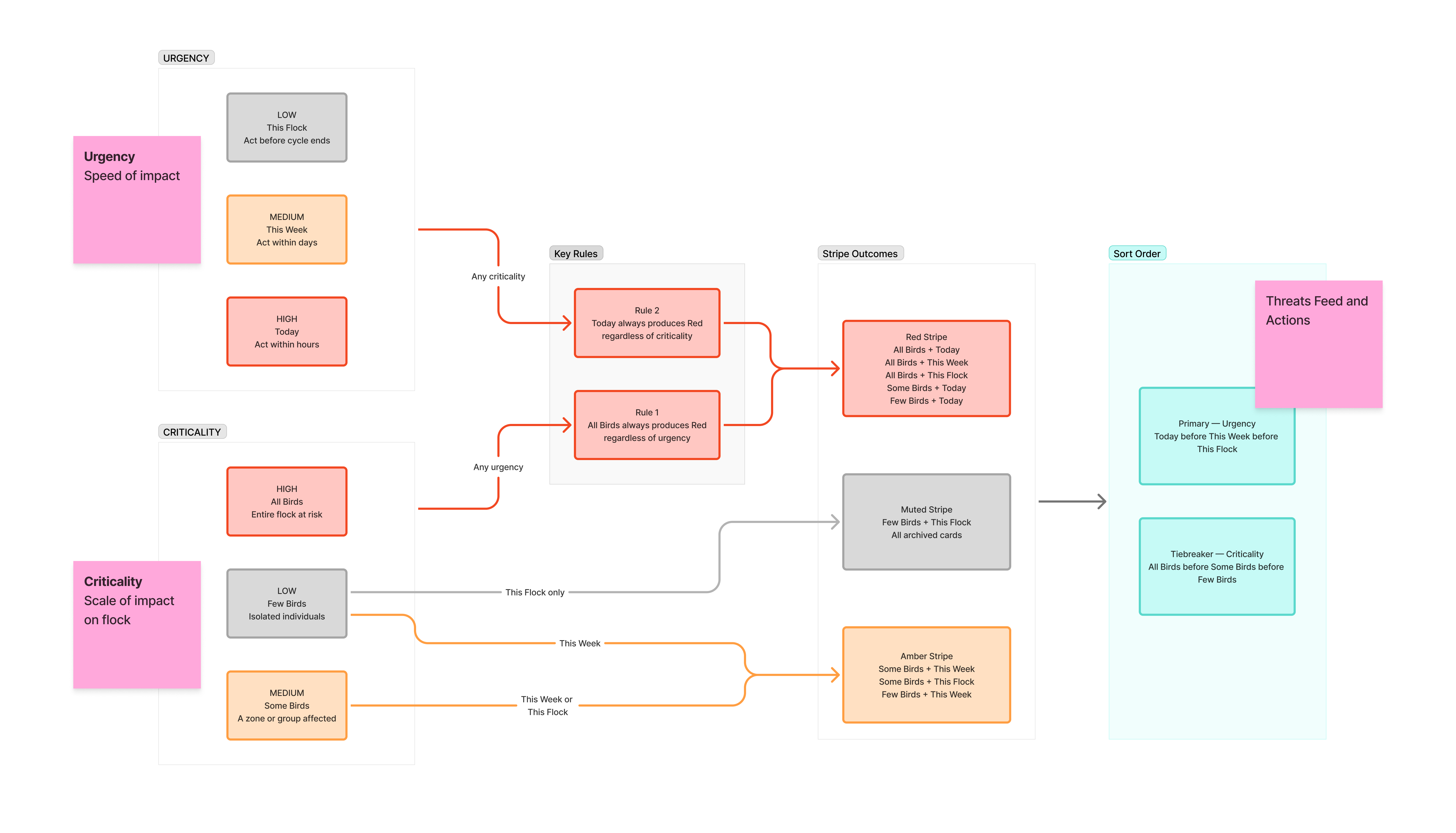
Two dimensions. One clear picture.
Every alert carries two independent signals: Criticality and Urgency. They’re separate because they answer different questions.
Criticality asks: how many birds are affected? All Birds means a flock-level issue. Some Birds means a group or zone. Few Birds means scattered individuals. The label matters because the same underlying problem — say, a temperature spike — has a completely different priority depending on whether it’s affecting the whole house or a handful of birds in one corner.
Urgency asks: when does this need action? Today means act now. This Week means monitor and prepare. This Flock means it’s a cycle-level concern, not an emergency.
Combined, they drive the visual severity of each alert card through a matrix. All Birds
- Today is red, unconditionally. Few Birds
- This Week is amber. Few Birds + This Flock is muted. Red is reserved for flock-scale threats — if a farmer sees a red stripe on a card, they know the whole house is at risk before reading a single word. That’s the design intent: the colour does the first five seconds of communication, the text handles the rest.
Default sort is urgency first, criticality as the tiebreaker. The most time-sensitive issues surface at the top regardless of scale.
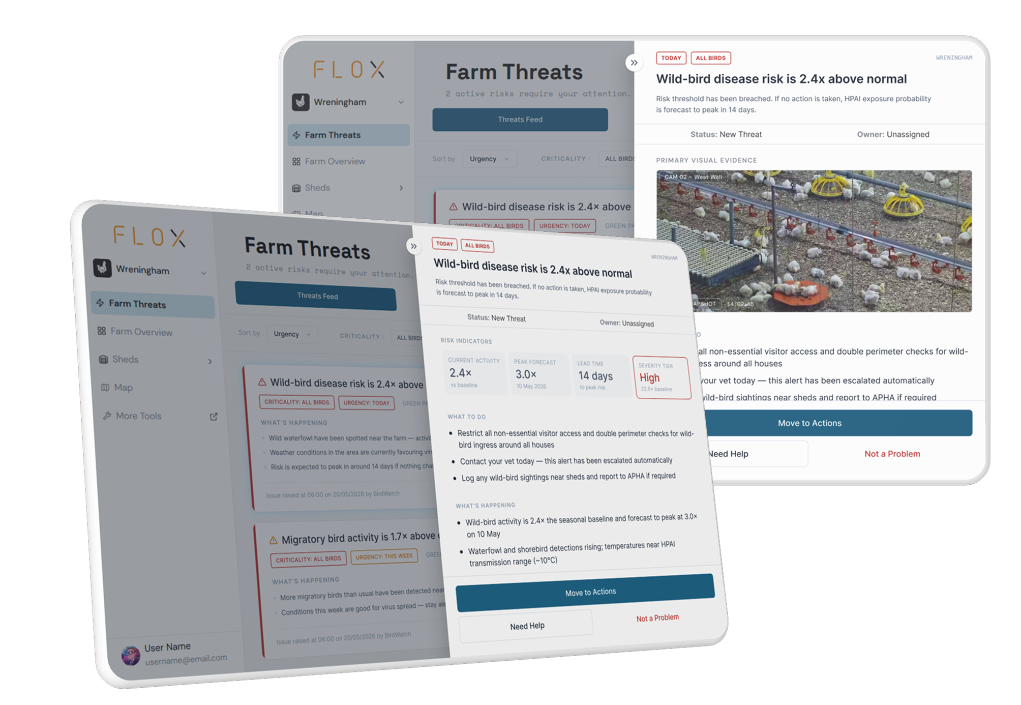
Tell me what’s wrong. And what to do about it.
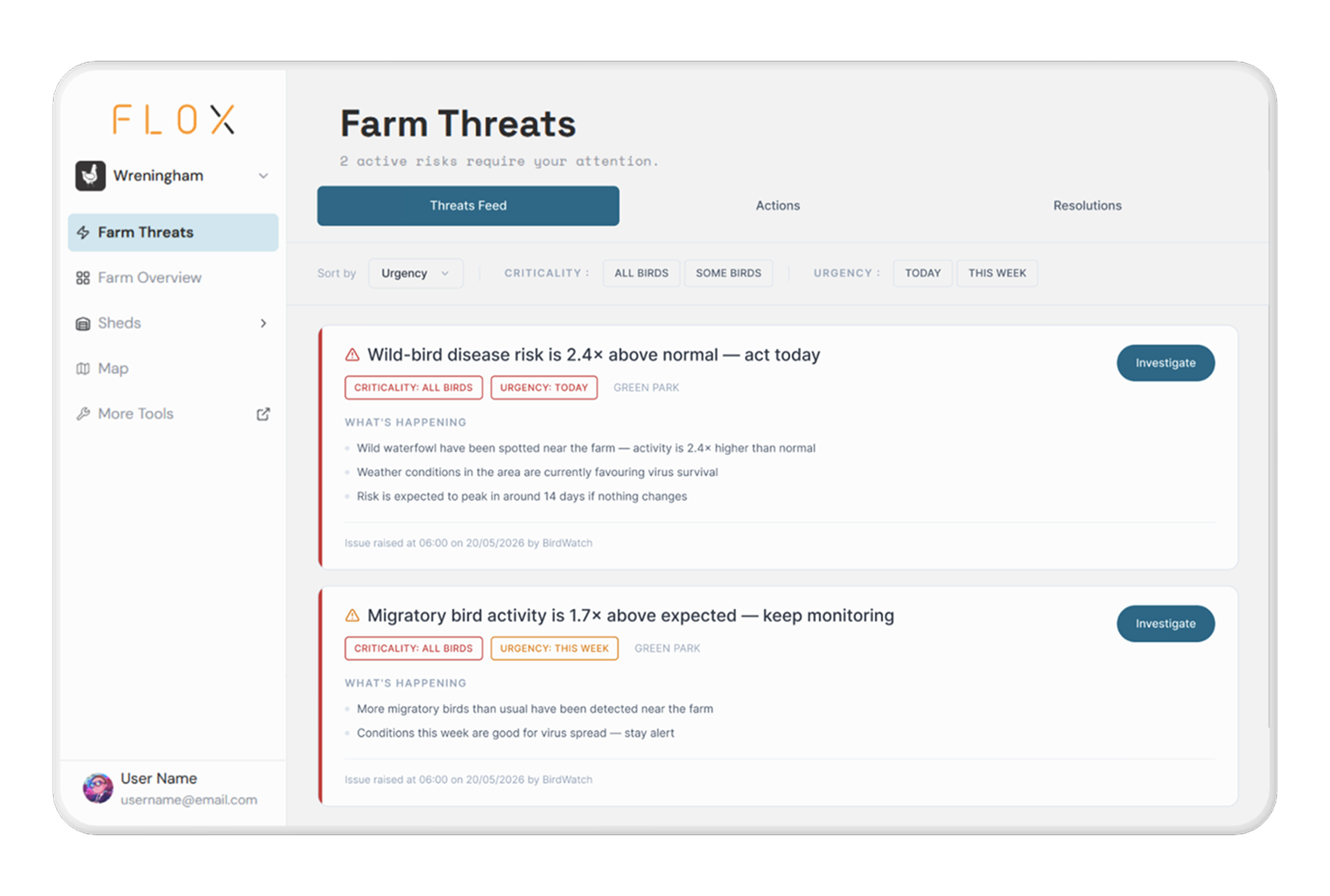
Every alert card carries two columns: What’s Happening and What to Do. This wasn’t an aesthetic choice — it was the product’s commitment to the farmer. We’re not showing you a data point and leaving the interpretation to you. We’re telling you what it means and what your next move is.
Tapping Investigate opens the detail panel. Primary visual evidence pulls a camera snapshot from the relevant shed — because a farm manager or vet assessing a clustering event will trust their own eyes before they trust a sensor reading. Below that, the Previous Flock Comparison widget pulls weight and mortality data from the last cycle, giving the farmer the historical context to judge whether what they’re seeing is genuinely unusual. The activity log tracks everything that’s happened to the alert since it was raised. Above the log, a persistent status bar shows the current ownership state — New Threat, In Progress, Under Review, Under Action — so anyone opening the panel knows immediately whether the issue is unowned, being handled, or waiting on someone else, without reading the full history.
The goal was that a farmer opening the Investigate panel should leave it knowing exactly what to do — without calling anyone or checking another screen first.
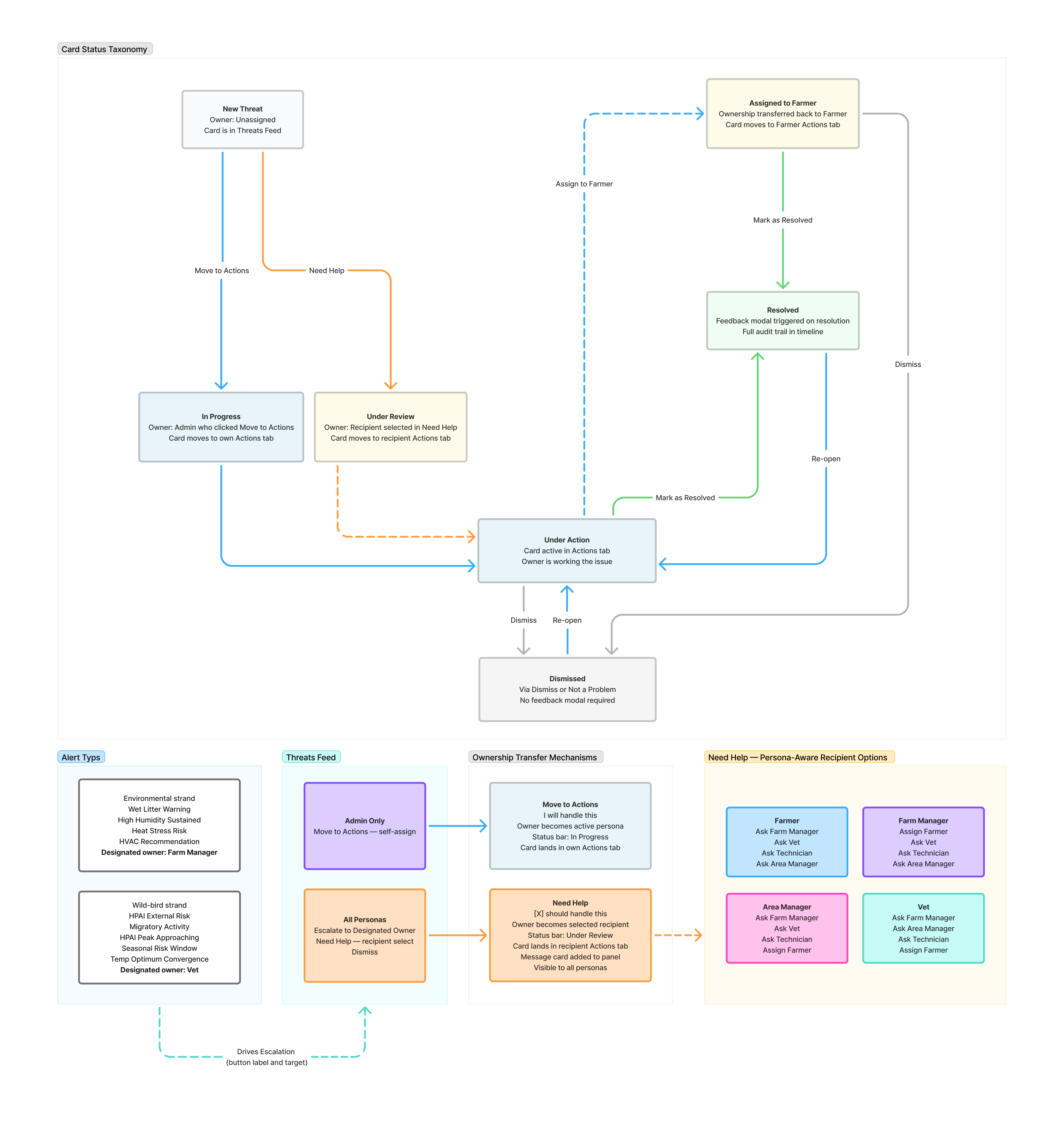
Not everyone’s job is the same.
Not everyone’s job is the same. Four personas interact with the same alert system in fundamentally different ways. The three-tab model — Threats Feed, Actions, Resolutions — is the backbone. Threats Feed is shared: every persona sees the same unacknowledged alerts. Actions is personal: each persona sees only what’s been acknowledged and routed to them. Resolutions is shared again: a full record of everything closed out. Three CTAs handle the routing, and each means something distinct. Move to Actions says I’ll handle this — the card moves to the active persona’s own Actions tab, and they become the owner. Escalate says the designated owner for this alert type should handle this — routing is automatic, not a judgment call. Need Help says X specifically should handle this, and here’s my context — ownership transfers to a named recipient, a message card is generated inside the panel for everyone to see, and the status shifts to Under Review rather than In Progress. The recipient options in the Need Help modal are persona-aware: you can never route to yourself, and that slot is always replaced with Assign Farmer instead. Getting the distinction between these three right in the UI — label, placement, visual weight — mattered because conflating them breaks the routing logic. The wrong action routes the card to the wrong person and the alert sits unowned. When an admin assigns a card to a Farmer for field action, it leaves their Actions tab immediately and appears in the Farmer’s. Ownership is transferred, not shared. No card is ever owned by two people at the same time. Two feedback mechanisms sit inside the system. The thumbs up/down in the Investigate panel captures alert quality — was this actually worth flagging? The Resolution Feedback Modal, triggered on Mark as Resolved, goes deeper: what action did you take, how useful was the recommendation, did it work? All fields are optional — feedback can never block a resolution. But the data that comes back from it is what teaches the system where it’s right and where it’s generating noise.
What shipped, and what I can actually own.
Threat Intelligence launched on top of Farm Intelligence as the first decision-led layer in the product. The alert lifecycle — from system detection through investigation, escalation, field action, and resolution — is fully implemented across all four personas. The feedback mechanisms are live.
The reception from the decision-makers and farm managers we interviewed during development was the clearest signal that the direction was right. The consistent read: it makes the workflow faster, it removes the guesswork, and it gets the right information to the right person without requiring anyone to become a data analyst to use it.
What I can’t fully own: time-in-field outcomes. The feature is recently launched. Whether the alert recommendations hold up under real farm conditions — across different flock stages, climates, and management styles — is still being learned. The feedback loop was built for exactly that reason.
On the horizon: a new satellite dataset from the European Space Agency, which the team is exploring as a way to make future alert types more defensible — better environmental signal to work with alongside the sensor and camera data already in the system. That’s a 2.0 conversation. The current system is already surfacing meaningful alerts and the priority is learning from how farmers are using it before adding more signal to the stack.
What I’d do differently.
The mobile experience needed more weight earlier in the process. Farm managers and farmers are not sitting at a desk when an alert fires — they’re in a shed with one hand occupied. Designing for a compact, glanceable alert card that still communicates criticality, urgency, location, and next action without requiring the full Investigate panel was a constraint that should have been a design input from the start, not a later refinement.
I’d also test the Dismiss versus Resolve distinction earlier with real users. In the spec, the difference is clear and intentional — dismissed cards skip the feedback modal, resolved ones don’t. In early sessions, some users reached for Dismiss when they meant Resolve, simply because the card felt dealt with regardless of which path they took. The labels are accurate. The behavioural pull toward the easier action is real. That tension is worth more testing than it got.