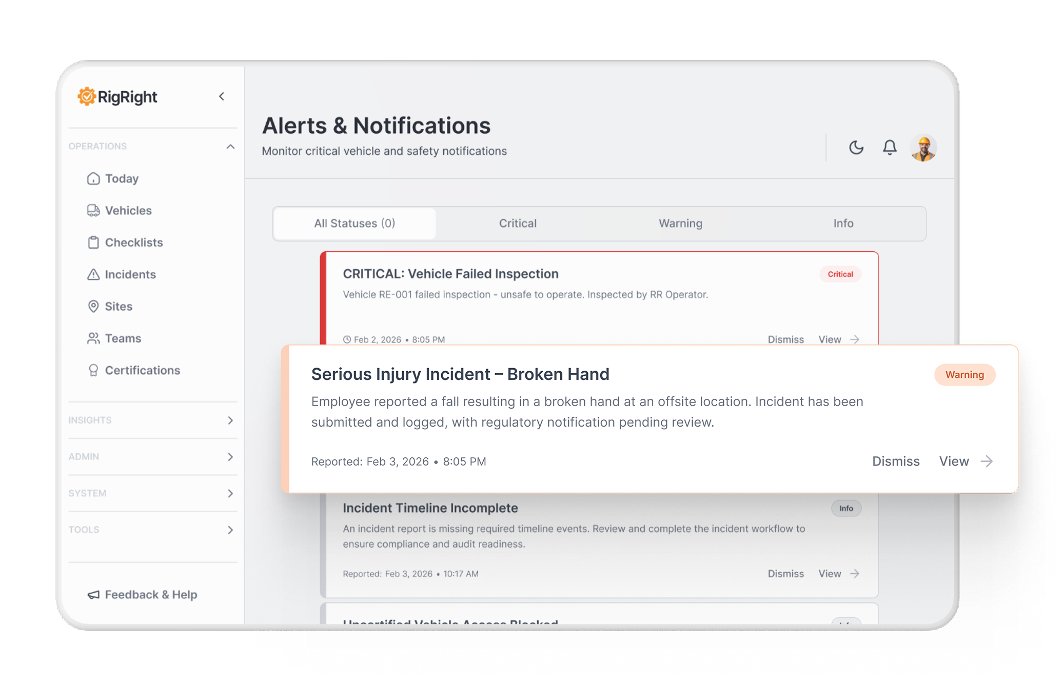
Same Warning, Different Color
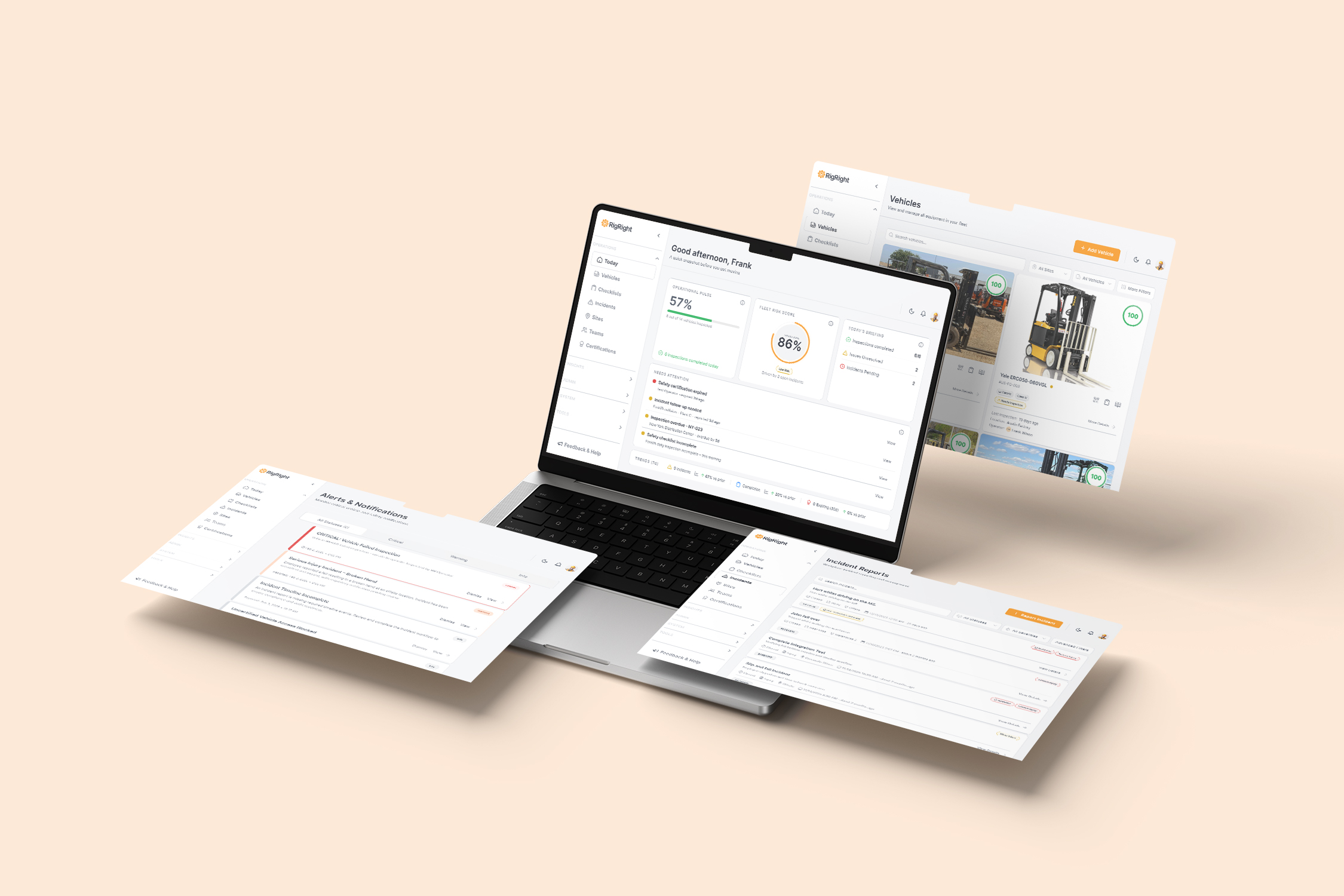
A safety compliance platform for forklift operators. Pre-shift inspections, fleet monitoring, incident tracking, certification management. Two distinct users: the operator on the floor who needs to know in five seconds whether their vehicle is safe to drive, and the admin at a desk who needs to know who’s certified, what’s critical, and what needs attention right now.
Both users needed the interface to be unambiguous. It wasn’t. The inconsistency wasn’t catastrophic — it was the slow kind. Button hierarchies that varied by screen. Status badges that meant different things in different places. Card patterns duplicated across modules with no shared rules. 186 hardcoded hex colors and 122 rgb/hsl values across the codebase. A design system that existed in principle but was losing ground to page-level drift.
That’s what a year looked like.

Two users. Two mental models.
One product that had to serve both.
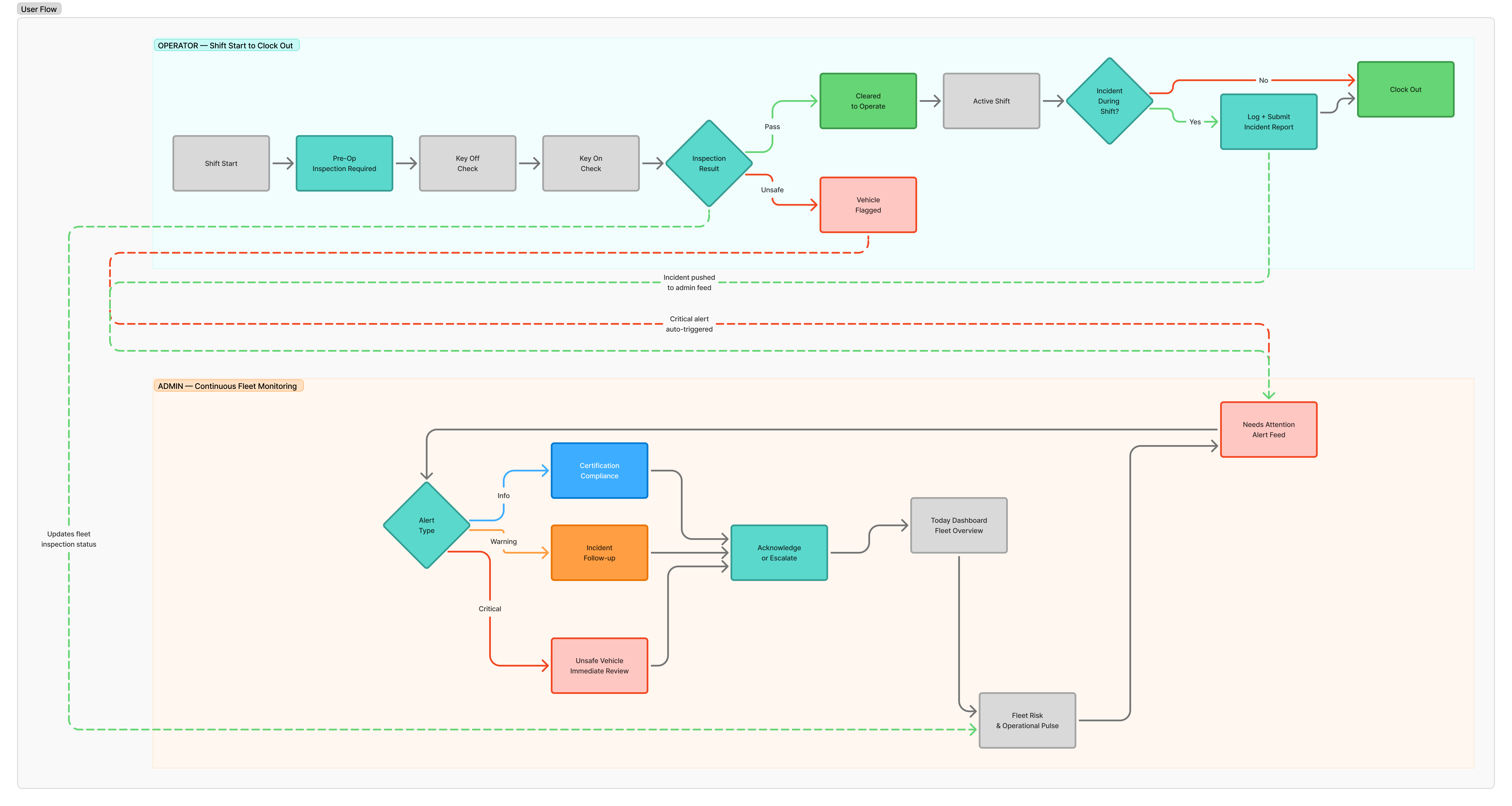
The operator experience and the admin experience weren’t just different layouts — they were fundamentally different jobs with different constraints. Operators were on mobile, on the floor, often starting a shift at 5am. They needed large touch targets, clear pass/fail states, and zero ambiguity about what to do next. Speed wasn’t a nice-to-have; it was a safety requirement.
Admins were managing fleets, reviewing incidents, tracking certification expiry, and making compliance decisions. They needed data density, reliable status semantics, and confidence that what they were reading was accurate.
The problem was that the same components were being styled differently across both contexts. Not intentionally, not with a documented reason, just through accumulated decisions that nobody had time to review. A “Warning” state in the operator dashboard looked different from a “Warning” state in the admin panel. The same card pattern existed in at least four variations with no clear owner.
The audit wasn’t the deliverable.
It was the permission structure.
Before designing anything new, the codebase needed to be understood honestly. A full component and token audit across pages and components turned up numbers that made the problem concrete rather than theoretical.
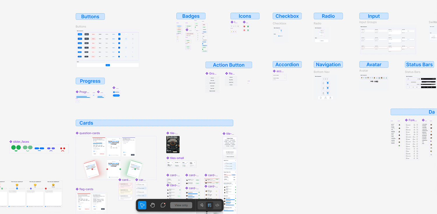
408 Button component instances across 109 files — plus 69 native button elements bypassing the component system entirely. 449 Card instances, but the base card primitive was being competed with by custom card shells scattered across incident, site, and settings modules. Status badges restyled inline per page rather than pulling from any shared semantic map.
The audit wasn’t the output. It was what made the rest of the work defensible. You can’t argue for standardization without showing what the lack of it actually costs. Every recommendation that came after had a number behind it.
The fix wasn’t a redesign.
It was a contract.
The existing primitive system — Button, Card, Badge, Input — was fundamentally sound. The problem was that there were no enforced rules about how to use them, so every page author made their own decisions. The answer wasn’t to scrap it and start over.
The Normalization Contract opened with one line: “This is a refactor contract, not a redesign.” That distinction mattered. A redesign would have meant new visual language, new layout decisions, new opinions about what the product should look like. A refactor contract meant something more disciplined. Standardize what exists, eliminate drift, enforce rules. No new patterns introduced outside the document. No layout changes. No brand changes. Just the work of making the product consistent with itself.
Cards got three explicit types — Status, Summary, List — each with defined structure, click behavior, and required states. Badge colors became semantic, not decorative: Critical mapped to the same visual treatment everywhere, and new statuses were required to map onto existing semantic buckets rather than introduce new colors. Button hierarchy was locked: one Primary action per surface, destructive actions never visually equal to navigation actions.
The contract also included a Definition of Done — written in engineering terms, not design terms. No raw Tailwind color utilities in UI components. No duplicate card wrappers. No clickable container rows with primary inline buttons. That level of specificity wasn’t accidental. The documentation needed to govern both human developers and AI coding tools being used in the refactor. Ambiguous rules produce ambiguous output regardless of who’s reading them.
The Grandma Test ended up in the governance doc for the checklist builder: “If any of these require guessing, the builder fails.” That’s not a principle I imported as a slogan — it’s the standard the product needed to meet for the people using it.
What I can actually own.
A year. Two user types. End-to-end flows across operator inspection, fleet management, incident tracking, certification management, and the checklist builder. The full component audit. The UI Rules contract. The design token system proposal and the RR component naming convention built for developer alignment.
The design-to-engineering collaboration was the heaviest part of the engagement. Making sure what was designed was what got built — not approximately, but accurately — meant documentation that went beyond specs. Every component rule had a reason. Every state had a defined visual treatment and a defined interaction. The goal was that a developer reading the contract could make the right call without a design review for every edge case.
What I can’t own cleanly: the full rollout of the refactor strategy. The audit outlined a phased migration — buttons and semantic tags first, then cards, then form controls and layout primitives. How far that went after my involvement is a different story.
What I’d do differently.
The governance document came later than it should have. It was written after the audit, which was after a year of building. The rules existed in my head earlier than they existed in writing, and the gap between those two things is where drift happens. A UI contract at the start of a project, even a rough v0, changes what gets built in the first sprint.
The dual-audience problem also deserved an earlier, more explicit conversation. Operator and admin were treated as separate design problems but shared the same component system. The rules for what “touch-friendly” means in an operator context versus what “data-dense” means for an admin surface weren’t formally documented until the audit forced the question. That conversation needed to happen in week two, not month eight.