One Dashboard To Rule Them All
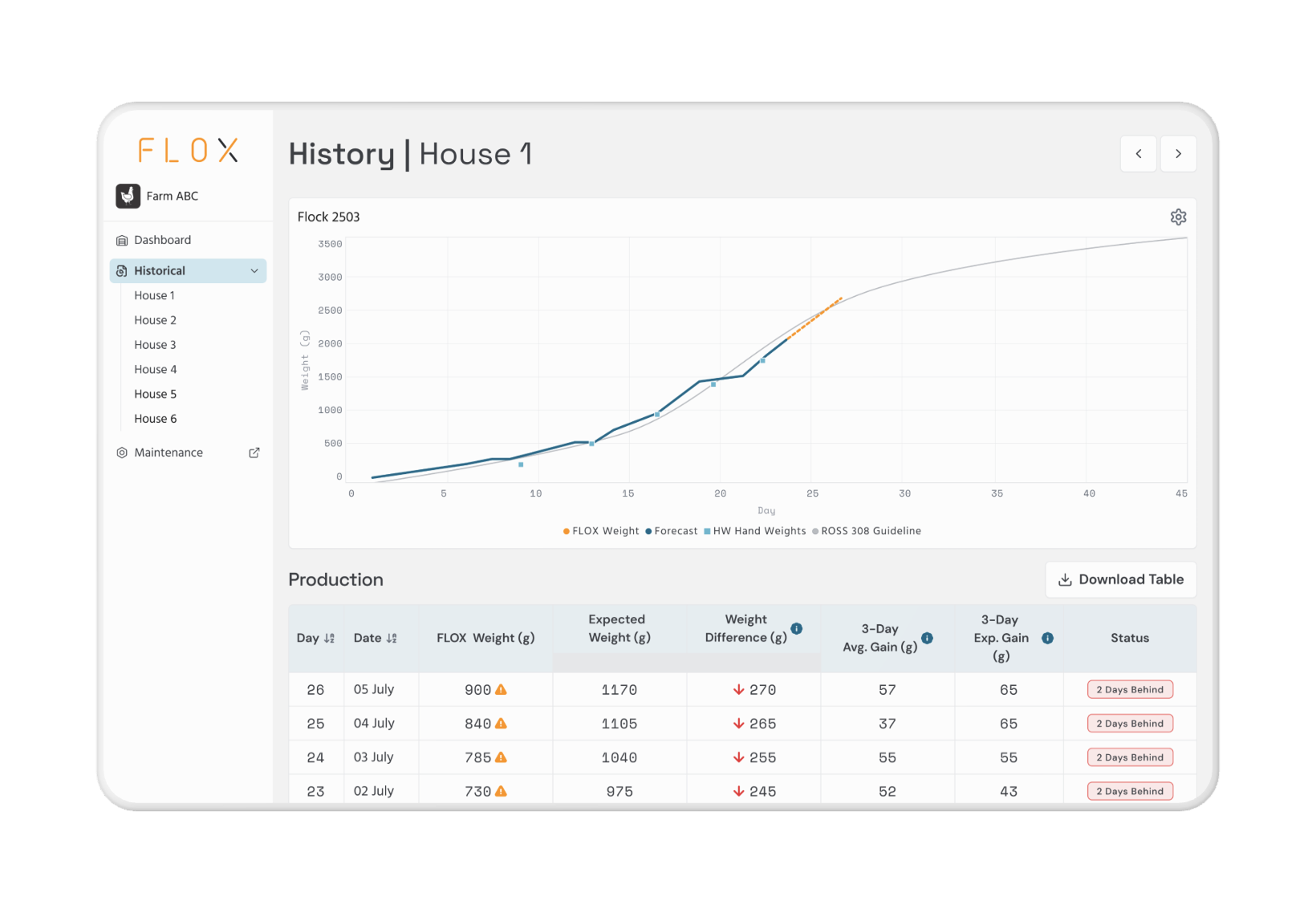
The beta did what it was supposed to do. Farmers could see how their flock was tracking against target weight. The Performance by Shed chart made it easy to compare houses at a glance. The day-level data table gave them the numbers if they wanted to go deeper.
Then they told us what it didn’t do. To get the full picture — weights, environment, cameras, historical flock data — they were navigating between separate dashboards. The data existed. It just didn’t exist in the same place. That’s not a data problem. That’s a design problem.
Farm Intelligence was built to solve it.
The beta shipped one dashboard. Farmers needed four.
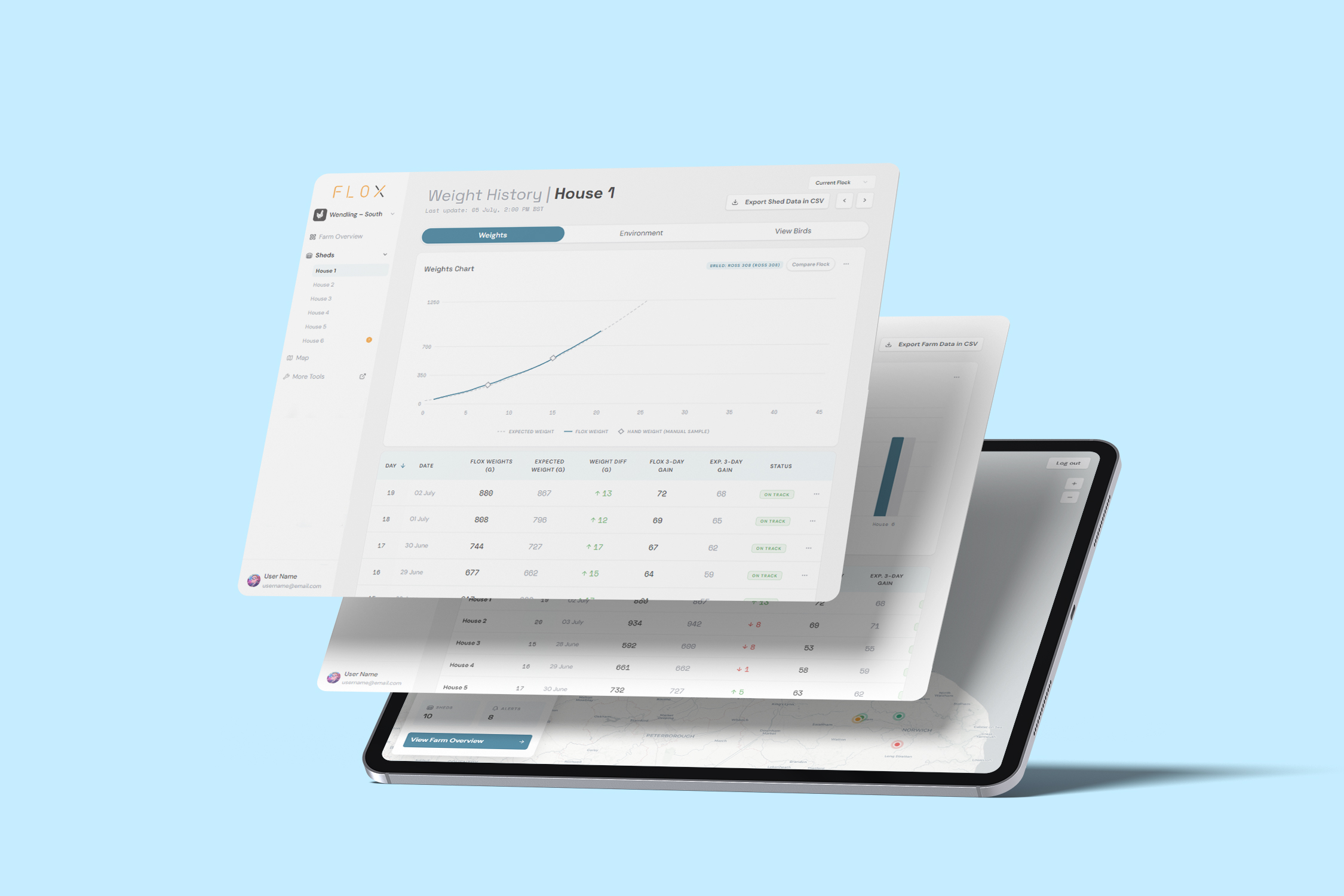
The beta Weights dashboard gave farmers two things: a farm-level view showing all sheds side by side, and a shed-level view showing weight history over the flock cycle. That was the core of the product at launch — weight data, clearly structured, easy to navigate.
What the beta didn’t include was everything else. Environmental sensors were in a separate system. Camera feeds were locally connected to each farm and not cloud-accessible. Historical flock comparison required manually pulling data from a different source. There was no map-based overview for area managers overseeing multiple farms at once.
The user interviews after beta were consistent: the weights data was useful, but the workflow was fragmented. Getting the full picture of a farm’s health meant jumping between too many places. The request wasn’t for more data, it was for the data to live together.
That feedback pushed the product from a single-purpose dashboard to a unified intelligence layer. Farm Intelligence wasn’t a new product. It was the architecture that made all the pieces coherent.
One entry point. Every data layer underneath it.
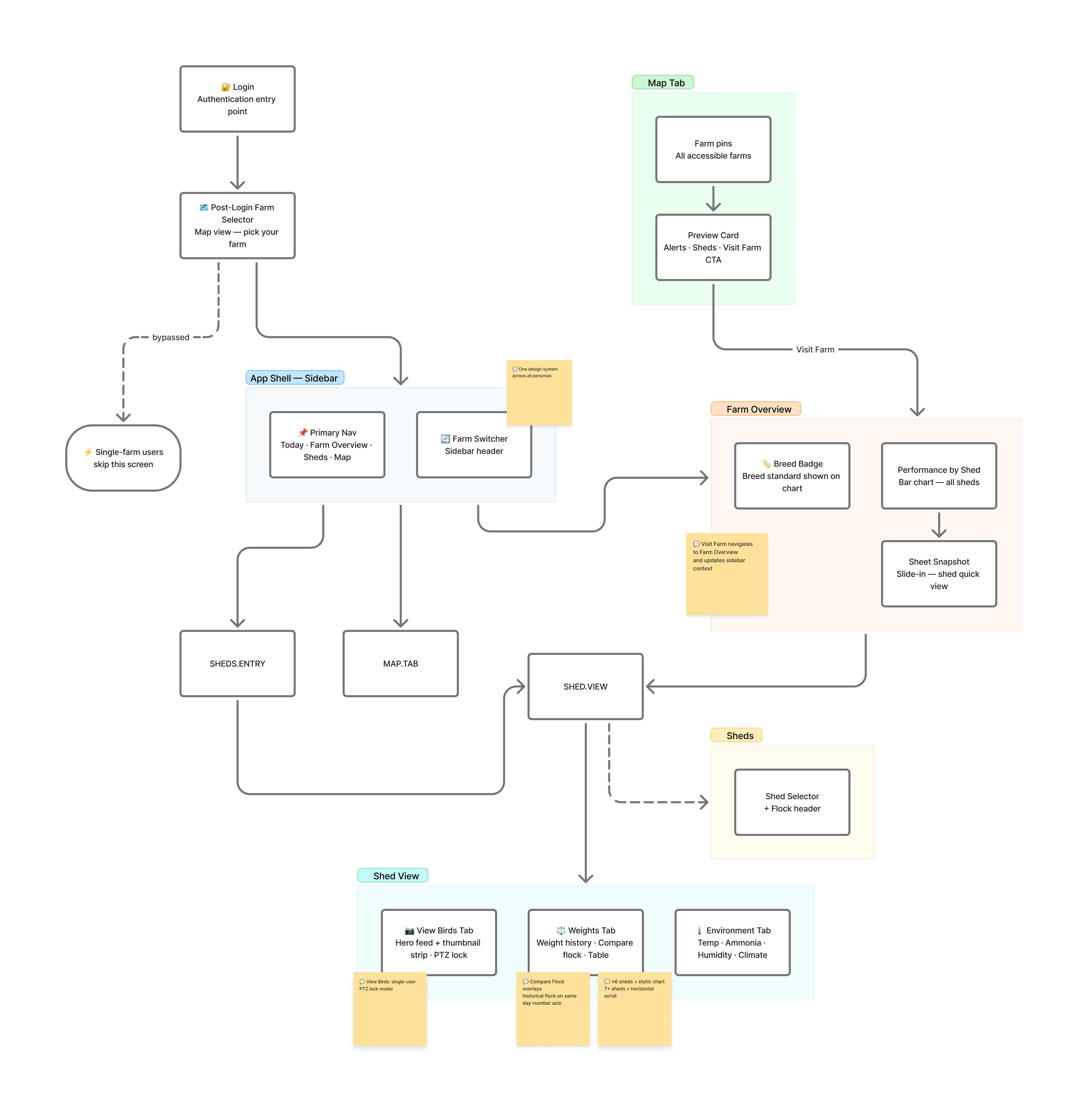
The navigation model for Farm Intelligence follows a simple hierarchy: Map ⇨ Farm Overview ⇨ Shed View. Each level gives you a different resolution of the same farm.
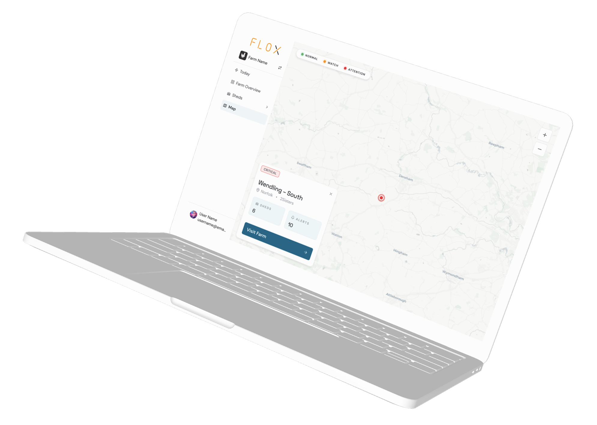
The Map is the spatial entry point. For area managers and integrators overseeing multiple farms, the post-login screen is a map with a marker for every farm they have access to. Each marker is coloured by the farm’s current status — green for on track, amber for watch, red for attention. You can read the state of your entire portfolio before you’ve clicked anything. Selecting a farm marker surfaces a preview card showing shed count, active alert count, and a Visit Farm CTA. Single-farm users bypass this screen entirely and land directly on their farm dashboard.
Farm Overview is the performance snapshot. The Performance by Shed chart — carried over from the beta — shows current FLOX weight versus target weight for every house, side by side. The Shed Performance table below it gives the day-level detail: current weight, target, variance, three-day gain, and predicted slaughter weight. A farm manager can see which sheds are on track and which need attention in under ten seconds.
The Sheet Panel gives quick access to a shed’s weight data without leaving the Farm Overview, a slide-in panel showing a compact weight chart and data table for the selected house. For quick checks it’s faster than navigating into Shed View and back.
Shed View is the deep dive. Three tabs — Weights, Environment, View Birds — for when the quick check isn’t enough.
The Shed View: three tabs, one place.
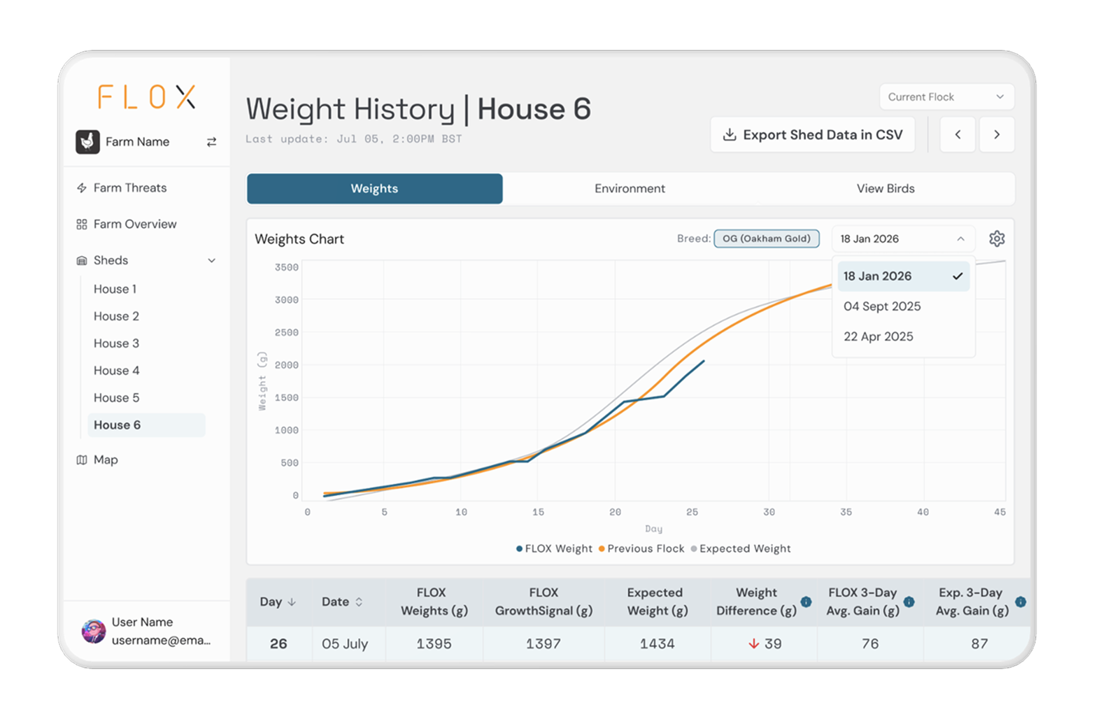
The Shed View is where the unification becomes most tangible. Before Farm Intelligence, these data sources were disconnected. The three-tab structure brings them under one roof without flattening what makes each one distinct.
Weights is the growth tracking tab. The Weight History chart shows FLOX weight versus target weight over the flock cycle, with a breed badge identifying the breed standard the targets are calculated against, this is relevant because different breeds have different growth curves and the comparison only makes sense if you know which standard you’re measuring against. The Flock Selector gives access to historical flock data for the same house, and Compare Flock overlays a second flock’s weight line onto the current chart with a shaded delta area between the two lines. For a farm manager looking at a weight alert, the first question is always: is this actually unusual, or did the last flock look the same at Day 28? Compare Flock answers that without leaving the screen.
Environment is the sensor layer — temperature, humidity, and the other environmental signals the shed emits continuously. The design priority here was trends, not just current values. A temperature of 28°C at midday means something different if it’s been climbing since 6AM than if it spiked in the last hour. The Environment tab makes that distinction visible.
View Birds is the camera layer. Live feed, PTZ controls for remote positioning, and image snapshots for review without scrubbing video. A farm manager who can see a clustering event in the north end of a shed before deciding whether to drive there makes a better decision than one acting on a data point alone. Visual confirmation was missing from the beta entirely. View Birds brings it into the same surface as the data it’s meant to confirm.
The tab names were a deliberate simplicity call. Early candidates included Growth, Sense, and Observe — functional but abstract. The final names are literal: Weights, Environment, View Birds. In a product used under time pressure, clarity beats cleverness. The tab you need should be obvious before you click it.
The Map as status layer, not just navigation.
The Map Module does two jobs in Farm Intelligence. For multi-farm users it’s the entry point, the spatial overview that lets an area manager orient before they drill into a specific farm. But its more important function is the status layer.
Every farm marker on the map is coloured by the worst-performing shed on that farm. Green means on track. Amber means watch. Red means attention. A user managing fifteen farms across a region can see which ones need their time before opening a single dashboard. The map doesn’t replace the data, it tells you where to look first.
Inside the app, the Map tab gives users the same spatial overview without logging out. When you navigate to the Map tab, your active farm’s marker is automatically selected and the preview card is open, it knows where you were and shows it to you. The Sidebar Farm Switcher provides a list-based alternative for users who prefer to navigate by name rather than location.
The status colours on the map use the same semantic tokens as the Threats feed — red, amber, muted — intentionally. If you’ve learned what red means in one part of the product, it means the same thing everywhere else.
What shipped, and what I can actually own.
Farm Intelligence launched as the unified product layer the beta was always pointing toward: Map-based entry, farm-level performance overview, shed-level investigation across Weights, Environment, and View Birds — all in one navigation model.
The Compare Flock feature ships with the full flock selector, delta overlay, and the visibility rules that keep it from appearing in historical views where it has no operational relevance. The End-of-Flock report — triggered automatically when a flock cycle completes — gives integrators and farm owners the compliance documentation they need inside the product they’re already using.
The feedback from stakeholder and user sessions after the beta was the clearest signal that the direction was right: farmers and farm managers consistently said the unified view reduced the mental overhead of monitoring a farm. Not just less navigation, a different experience of understanding what was happening.
What I’d do differently.
The Sheet Panel, the slide-in compact weight view on the Farm Overview was a late addition that came out of watching how users navigated the beta. They were clicking into Shed View just to check a single number and then navigating back. The Sheet Panel solved that. But it should have been part of the original architecture rather than designed in response to a behaviour we should have anticipated. That pattern users doing extra navigation for quick checks is predictable enough to design for upfront.
The Map also ships without a fallback for farms with no coordinates set. The marker doesn’t render, but the farm still needs to appear somewhere accessible. The Sidebar Farm Switcher covers it, but it’s a gap that should be a first-class empty state on the map itself, not a fallback to a secondary navigation pattern.