Plot Twist: And Then There Were Two

Two products. Two distinct audiences. Two completely different value propositions living under the same roof, marketed with enough shared language that users weren’t always sure which one they were in, or why it mattered.
That’s not a branding problem. That’s a UX problem that shows up everywhere — in onboarding, in navigation, in the moment a user lands on something and silently decides it’s not for them.
That was the problem. Everything else followed from there.
The products weren’t the issue.
The mental model was.
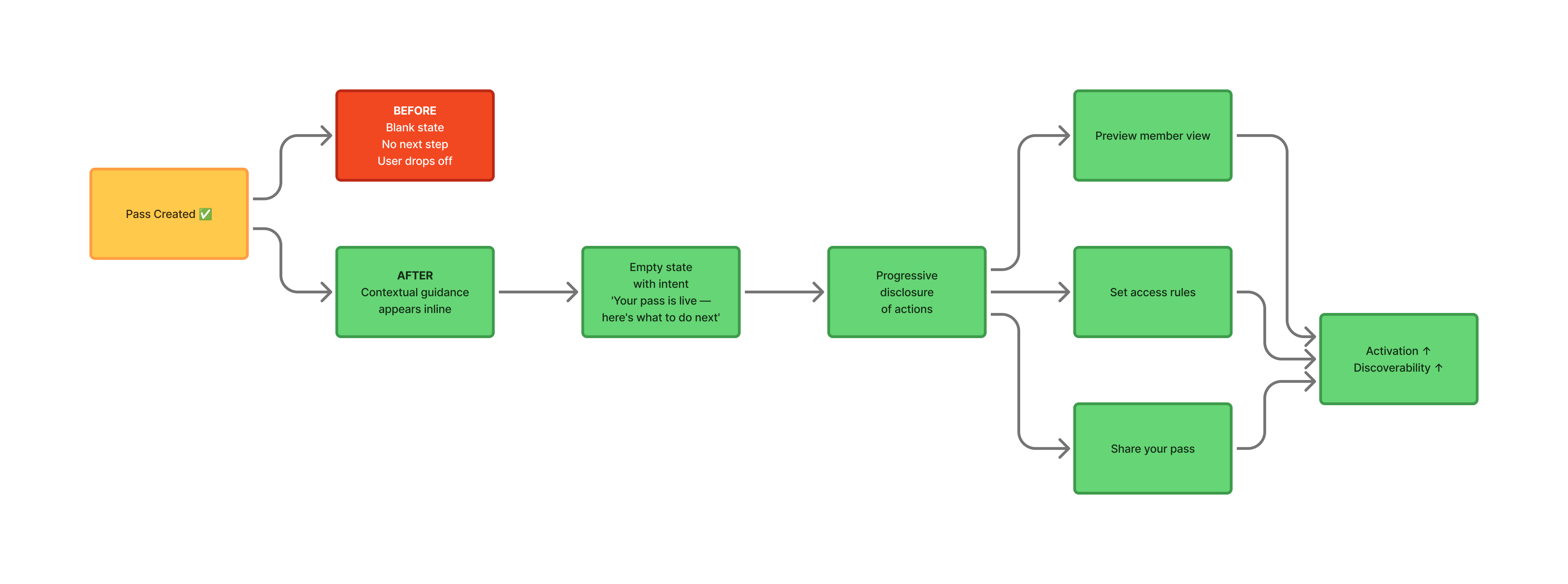
Pique and Passport weren’t bad products. Pique was a creator-driven social amplification tool. Brands partnering with creators to generate reach at scale. Passport was a pass creation platform. Creators building gated experiences and communities around digital passes.
Different users. Different jobs-to-be-done. Different reasons to care.
The confusion wasn’t happening because the products were bad. It was happening because the experience wasn’t helping users locate themselves inside them. If you have to explain what something is after someone is already using it, the design hasn’t done its job yet.
The moment after a pass is created
is the most dangerous moment in the product.
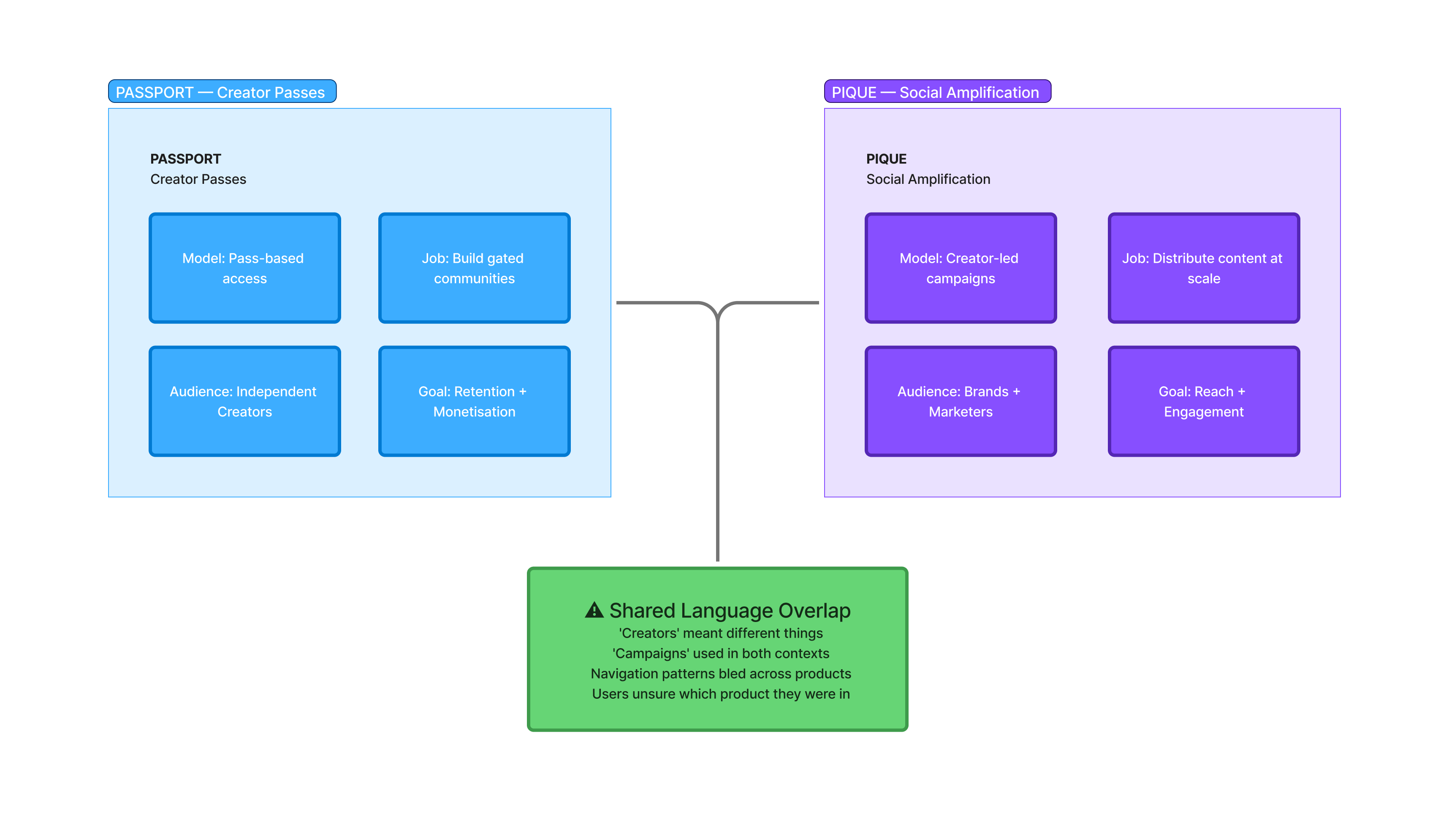
The activation gap in Passport was the clearest UX problem in the engagement. A user creates a pass, they’ve completed the thing the product exists to help them do, and then nothing helpful happens next.
No contextual nudge. No checklist. No “here’s what this unlocks for you.” Just a created pass and a blinking cursor, effectively.
That gap is where products lose people. Not during signup. Not during the creation step. Right after the thing they came to do is technically done, and they still don’t know what to do next.
The work here was about injecting clarity into that exact moment: inline guidance, empty states with intent, contextual actions surfaced at the right time. Progressive disclosure of what comes next, sequenced so it felt like assistance instead of instructions.
Untangling two products is mostly listening work.
Before any redesign work, I needed to understand where the confusion was actually coming from. That meant mapping the existing user journeys for both products separately — not as a combined ecosystem, but as two distinct experiences with distinct entry points, distinct goals, and distinct mental models.
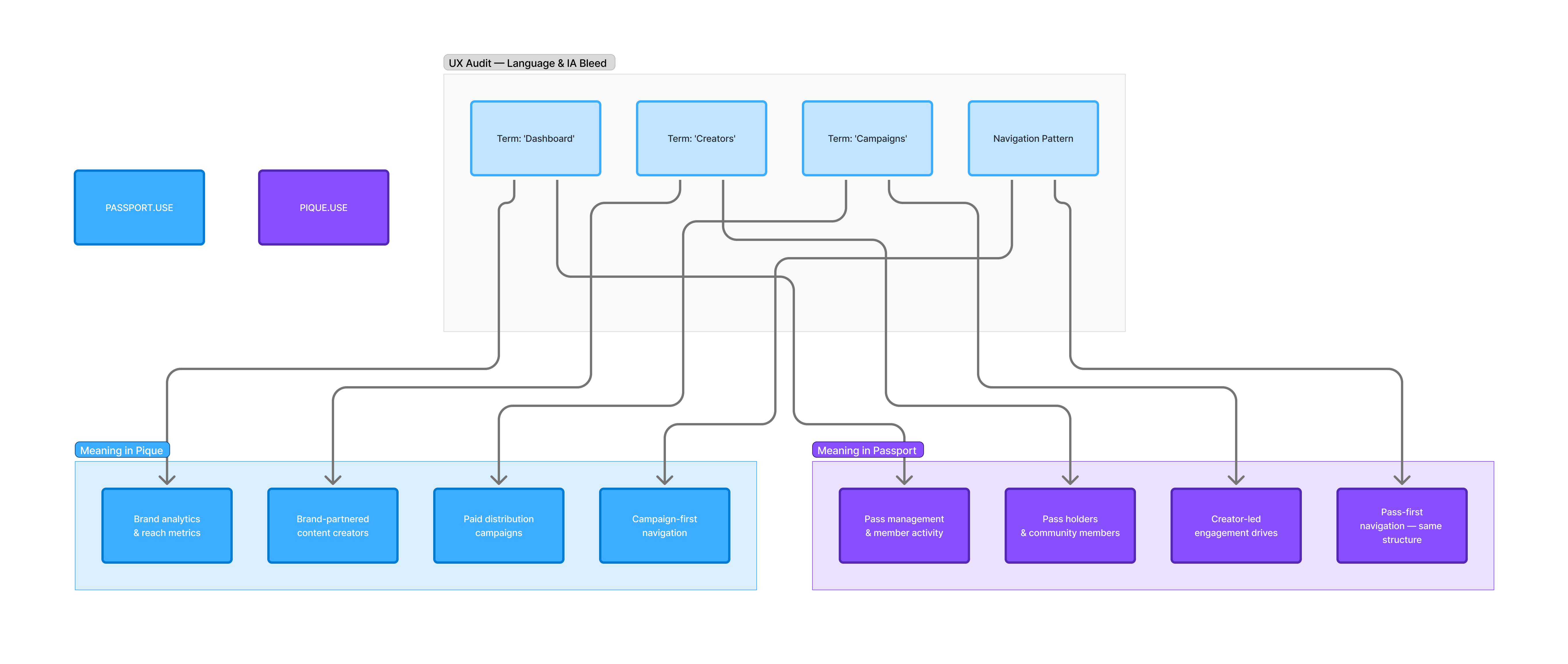
The audit surfaced a pattern: the language and IA across both products had started to bleed into each other. Terms that meant one thing in Pique were being reused in Passport with a slightly different meaning. Navigation structures that made sense for one audience were being carried into the other by default. Small decisions, compounding into real friction.
The intervention wasn’t a redesign. It was a clarification, separating the experience language, sharpening the distinction between what each product was for, and ensuring that a user in Passport never had to think about Pique to understand what they were doing, and vice versa.
What I can actually own.
Five to six months. Ambiguous product scope. A fast-moving team still defining what it was building. That combination is either where product designers do their best work or their least visible work, depending on how you operate in it.
What I can stand behind: the post-pass creation experience was meaningfully improved. The distinction between Pique and Passport became something the design reflected, not just something the copy tried to explain after the fact. The UX foundations — token naming, component logic, developer-aligned structure — were laid with enough intention that the next person in wouldn’t be building on guesswork.
Pique operated at scale. Campaigns targeting hundreds of thousands to millions of views. Engagement metrics that made the business case for the product real. I’m not claiming those numbers — they predate and outlast my involvement. But that’s the weight of what the UX needed to hold up under. That context shaped how I thought about every activation decision.
What I’d do differently.
I’d push earlier for documented product definitions. Not marketing copy, but a shared internal agreement about what each product was, who it was for, and where the line between them was. When that clarity doesn’t exist in writing, it ends up getting resolved through design decisions that weren’t meant to carry that weight.
The other thing: short engagements in complex product environments need a faster orientation phase. I spent time I didn’t have mapping what should have already been mapped. That’s not a criticism of the team, but it’s a lesson about what to ask for on day one, regardless of how much runway you think you have.